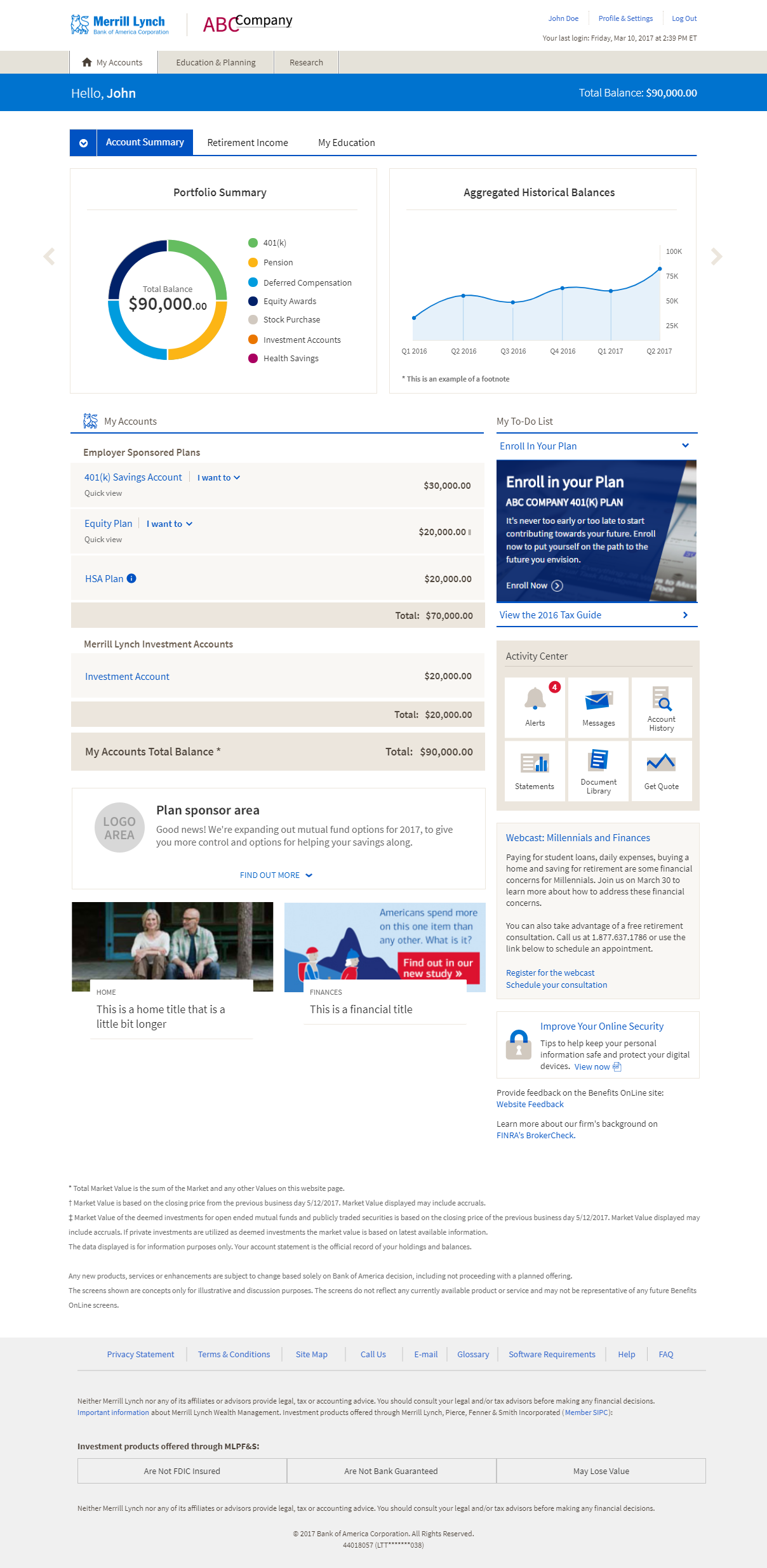
Benefits Online
Category: UI / UX
Role: UI/UX Designer
Year: 2017
Client: Bank of America Merrill Lynch
Technology: UXPin, Adobe Illustrator
The Challenge
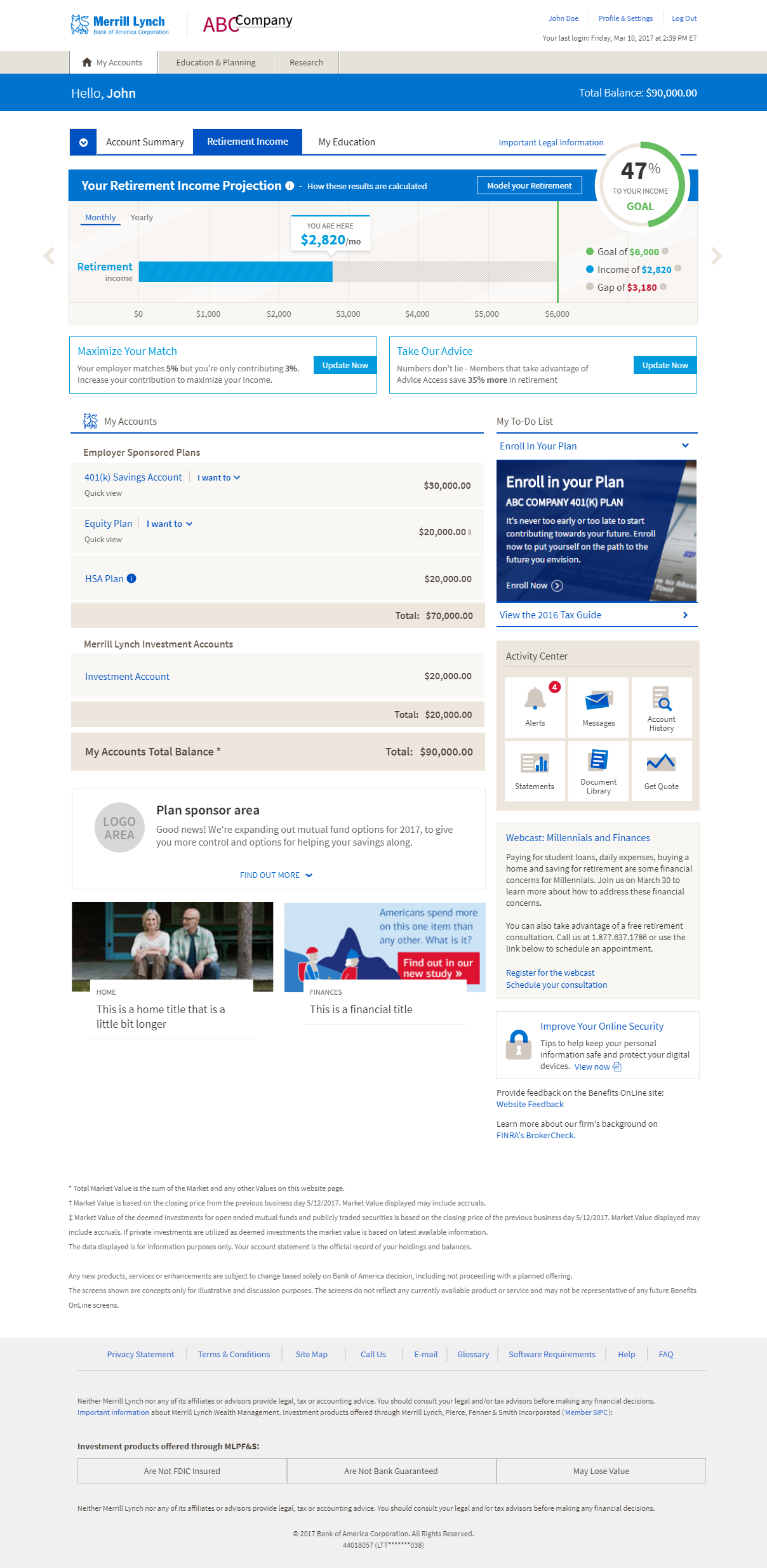
The Benefits Online project was a redesign of a 401k retirement platform landing page. The goal was to update the branding and style to match the other BoA Merrill Lynch platforms and to design a new retirement planner to keep up with competitors. The client was looking for a visual graphic that the user could interact with to update their contribution rate.
The Process
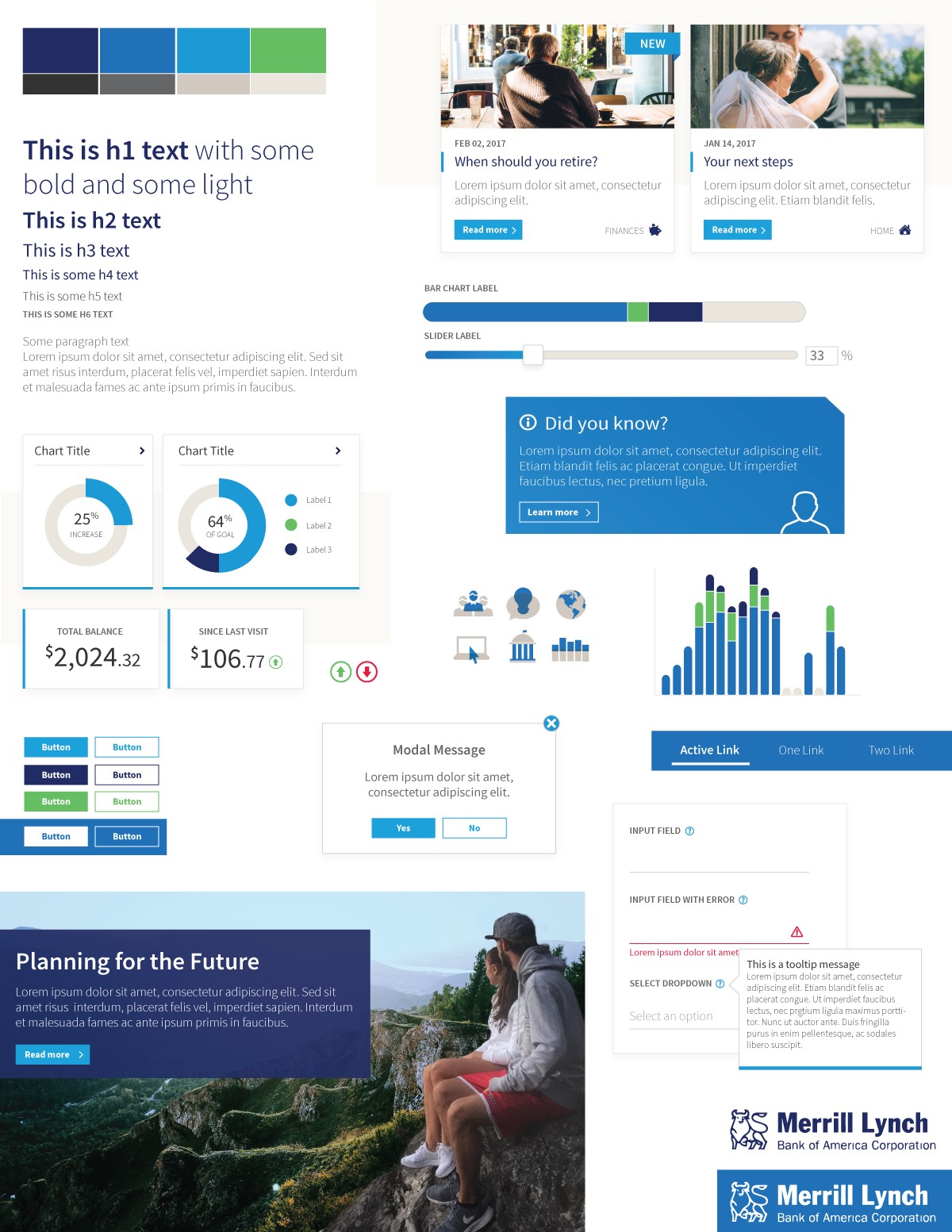
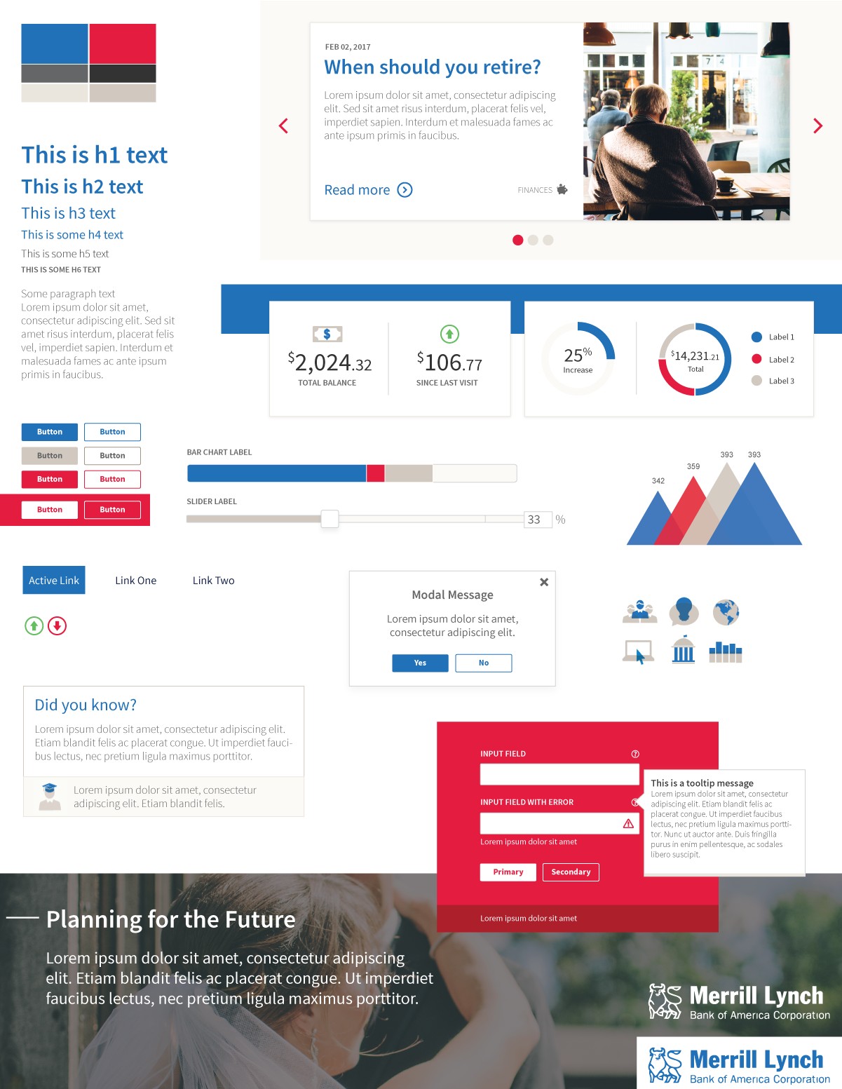
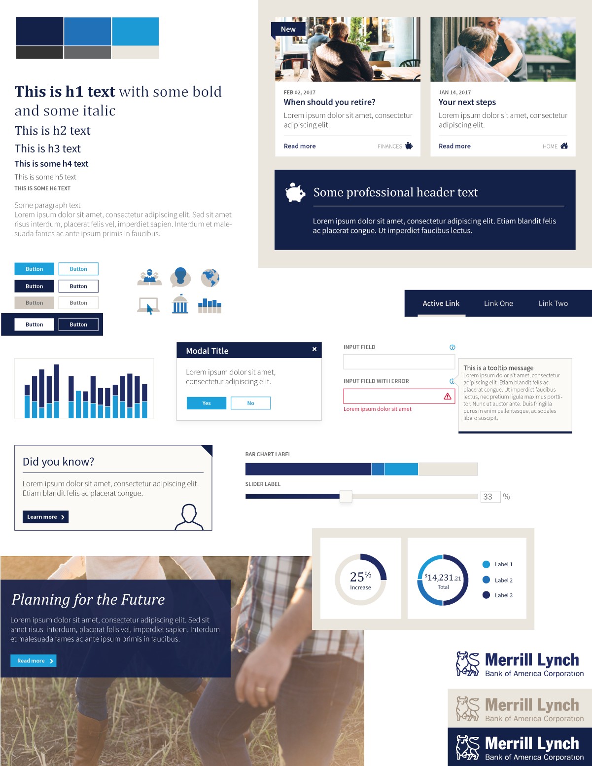
I was a UI/UX designer responsible for iterating on designs and delivering a final UXPin prototype to the BoA Merrill Lynch development team. The project started with a competitive analysis of competitor retirement platforms to help generate ideas. Then, we created style tiles so the the client could decide between branding options for the site. We analyzed other BoA Merrill Lynch platforms to determine the standard components our redesign would need and then prototyped them in UXPin – this drove a lot of the look and feel of the design. There were many iterations of retirement planner designs based on client feedback, so once we narrowed the planner designs down to two options, we conducted an overall usability test and A/B testing with users to drive the final decision.
The Outcome
All that was left to do was to finalize the components and finish the UXPin prototype. The final high-fidelity prototype was extremely realistic and contained all of the exact styling, interactions, animations, iconography, etc. required for the design. Developers were able to easily grab the design requirements from UXPin’s Spec Mode, which provides the exact pixel sizes and color codes to help streamline the development process. The UXPin prototype was so realistic that after the project was finished, we were asked to create more prototypes so that the BoA Merrill Lynch training team could use them to create training videos.
Style Tiles
Created in Adobe Illustrator
