HHA Payer Platform
Category: UI / UX, Web Development
Role: UI/UX Designer, UI Developer
Year: 2020
Technology: HTML, CSS, JS, Zurb Foundation, Adobe XD
Redesigning a HHA Payer platform
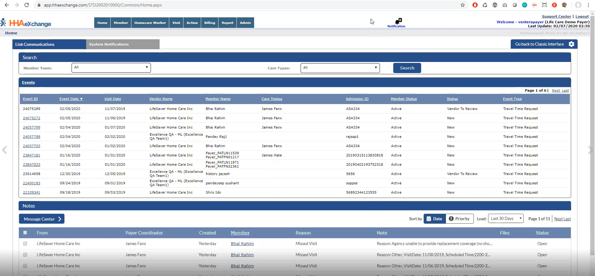
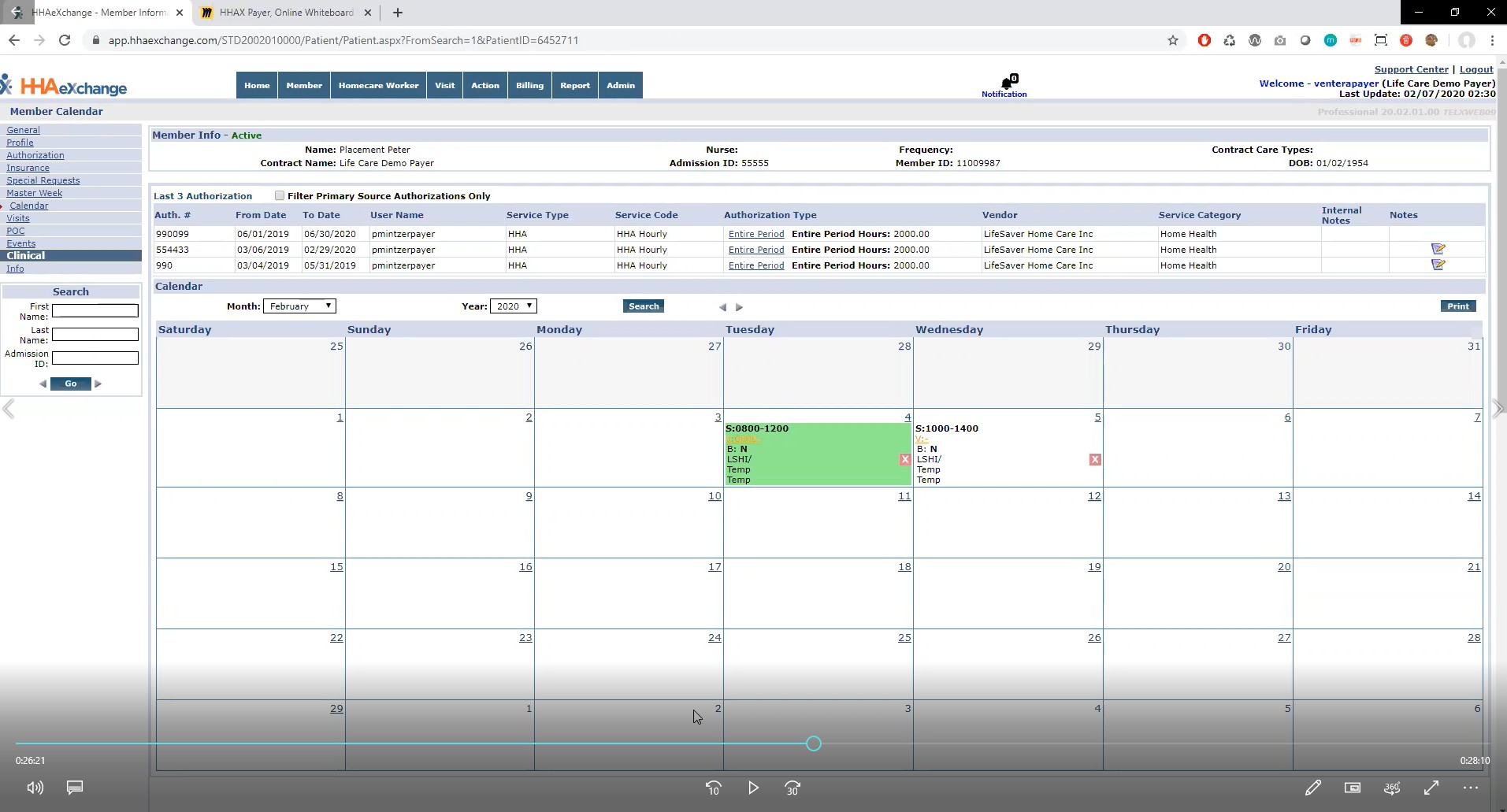
The purpose of the project was to redesign an outdated platform for Payers (insurance providers). The platform allows Payers to coordinate member care between healthcare Provider, Caregiver, and Payer systems. The primary workflow includes Payers placing members with Providers and tracking patient care from initial placement through the caregiver visit. The client wanted a modernized UI that was responsive, accessible, and scalable for future functionality. We were tasked with delivering high-fidelity designs and UI code to the client’s development team to integrate with the real application.
Learning the system
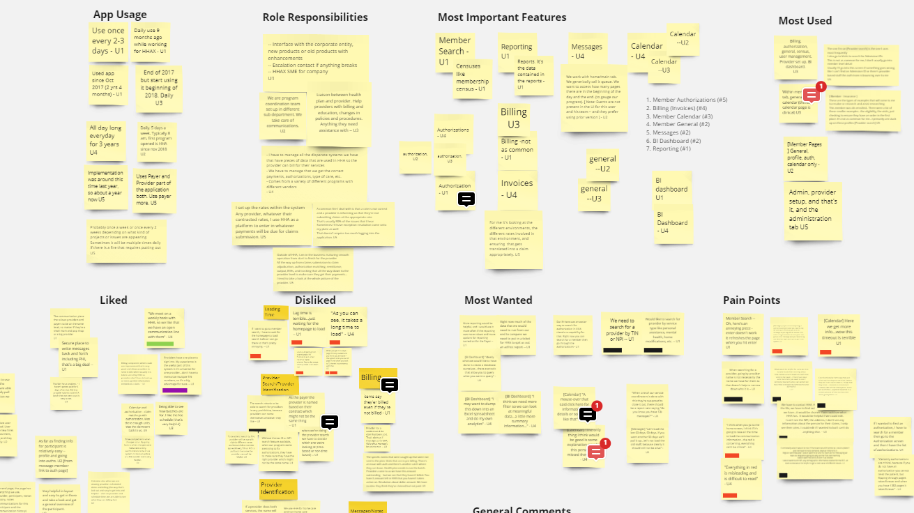
To identify existing pain points and areas for improvement, we conducted a series of user interviews with end users over Zoom where they walked us through the site and explained how they used it. We used affinity mapping to identify common themes, helping to identify key functionality and opportunities for enhancements based on user feedback.
Iterating on designs
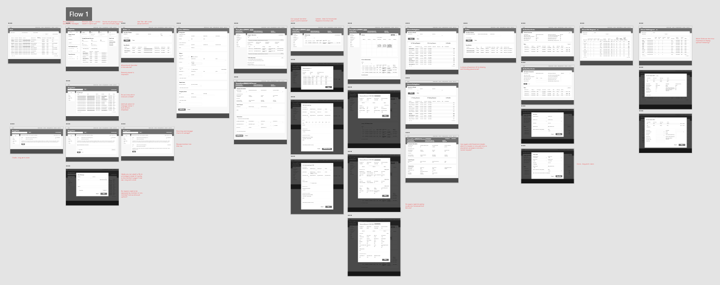
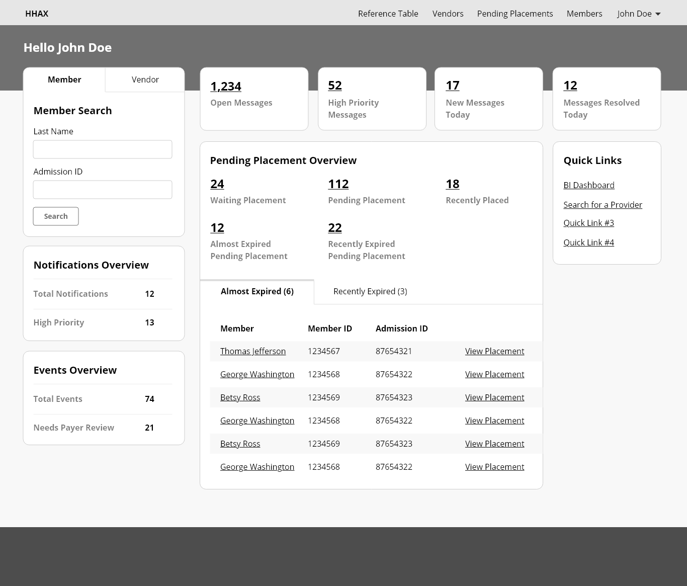
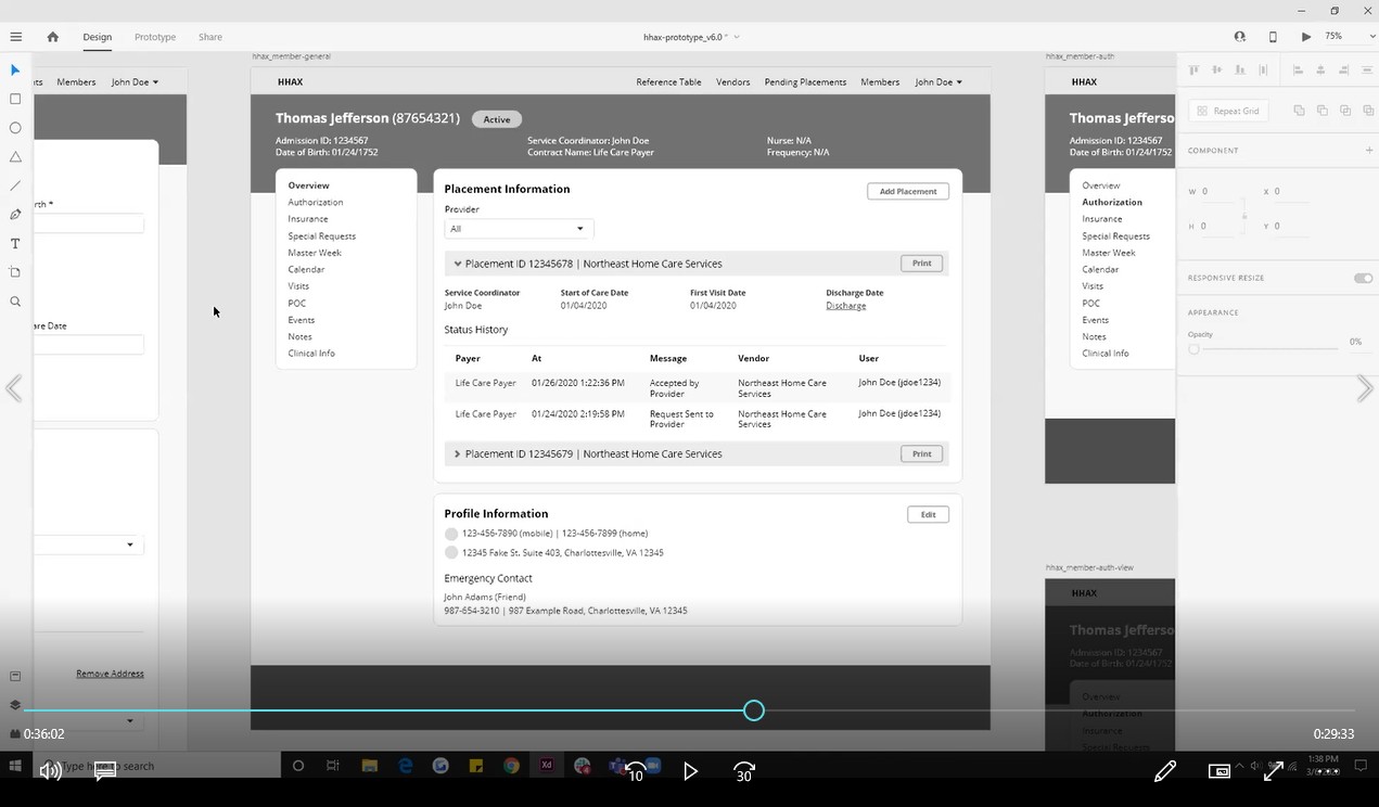
Once we had a good handle on the purpose of the application and areas for improvement, we began creating initial designs. We iterated on multiple rounds of wireframes in Adobe XD and used the tool’s prototyping functionality to create a clickable prototype. The wireframes were used to drive design discussions between the design team and stakeholders.
Getting user feedback
After iterating on the wireframe prototype and receiving stakeholder input, we went back to the end users to get feedback on the proposed designs. We asked users to perform a series of tasks with the wireframes to gauge if the design was effective. The testing verified the overall direction and identified specific areas for improvement.
Prototyping in high-fidelity
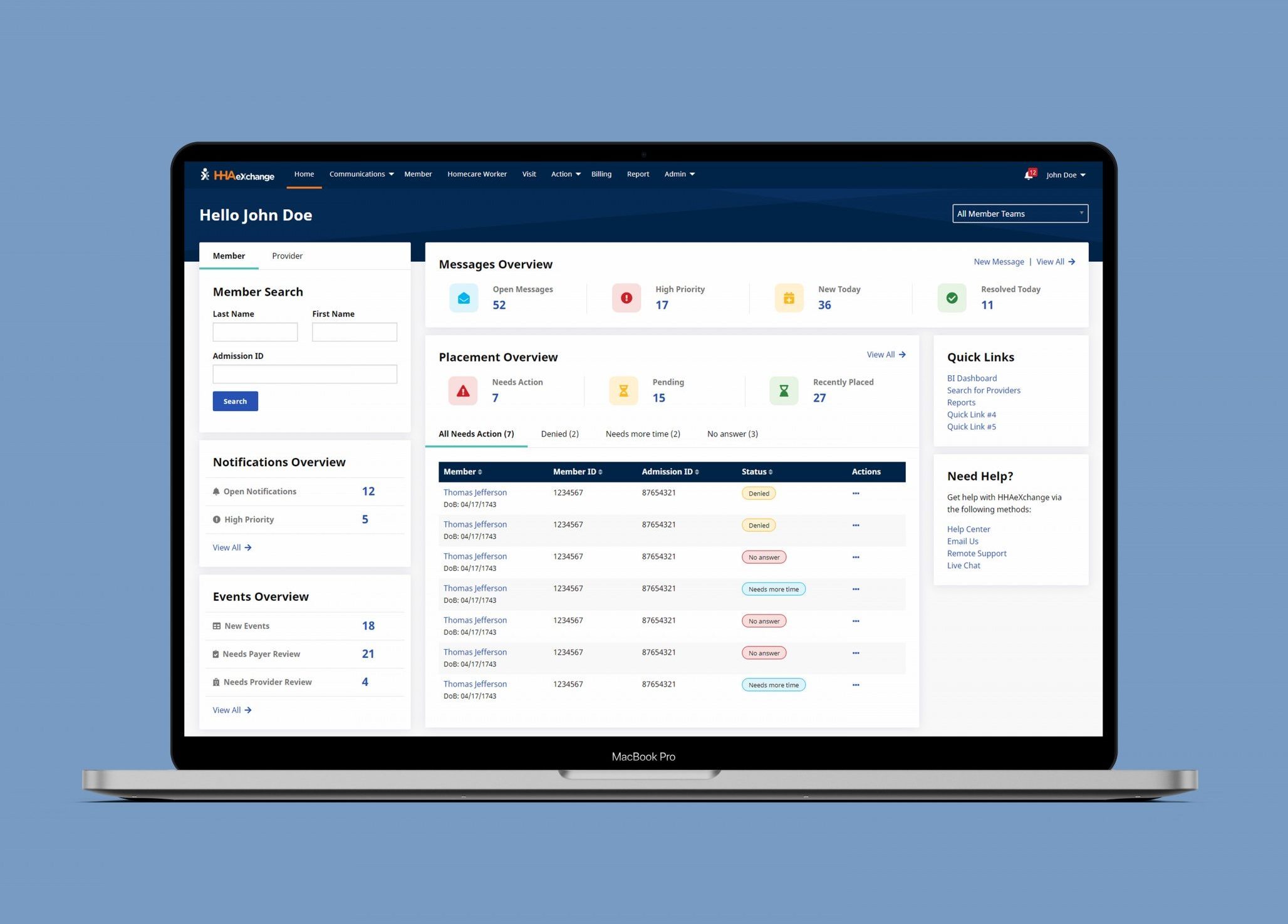
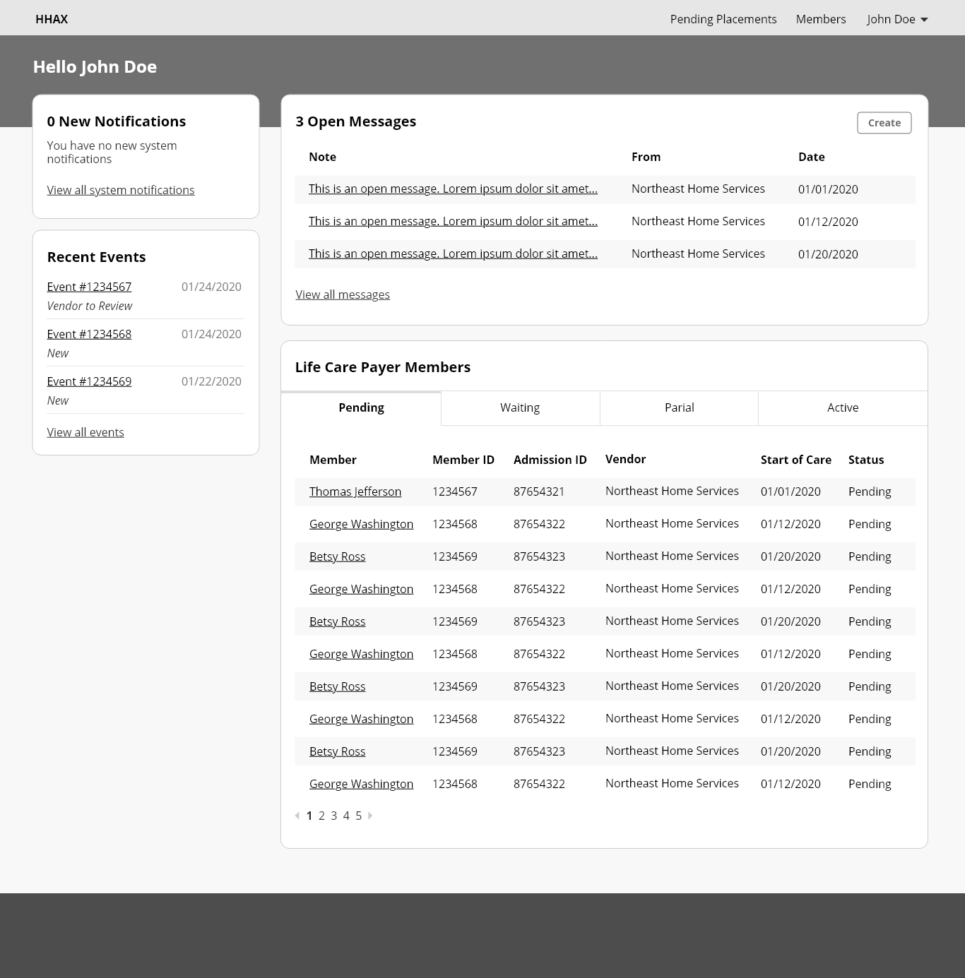
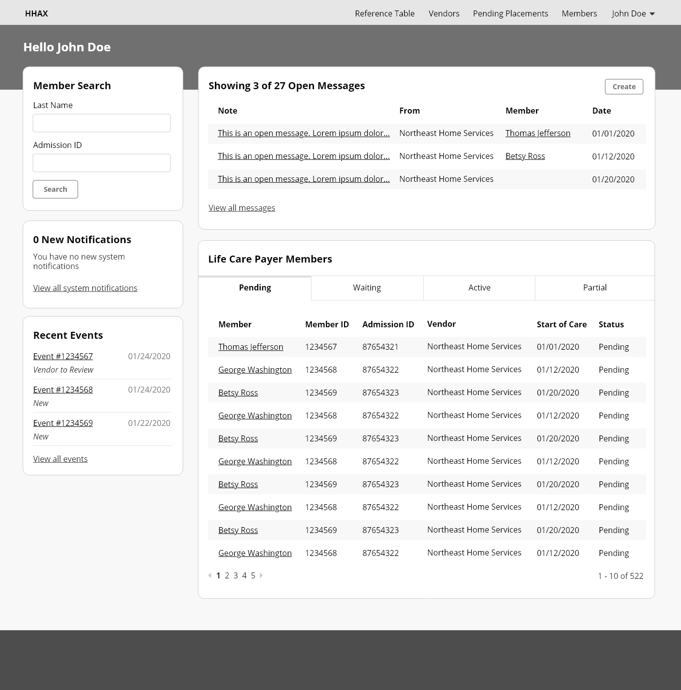
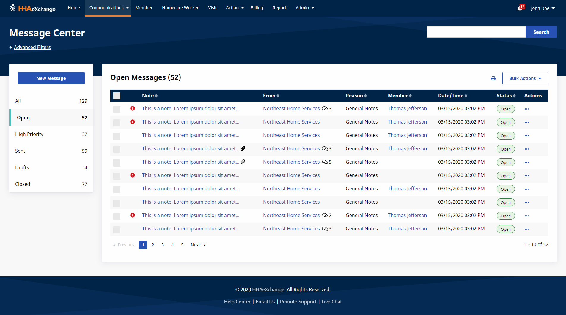
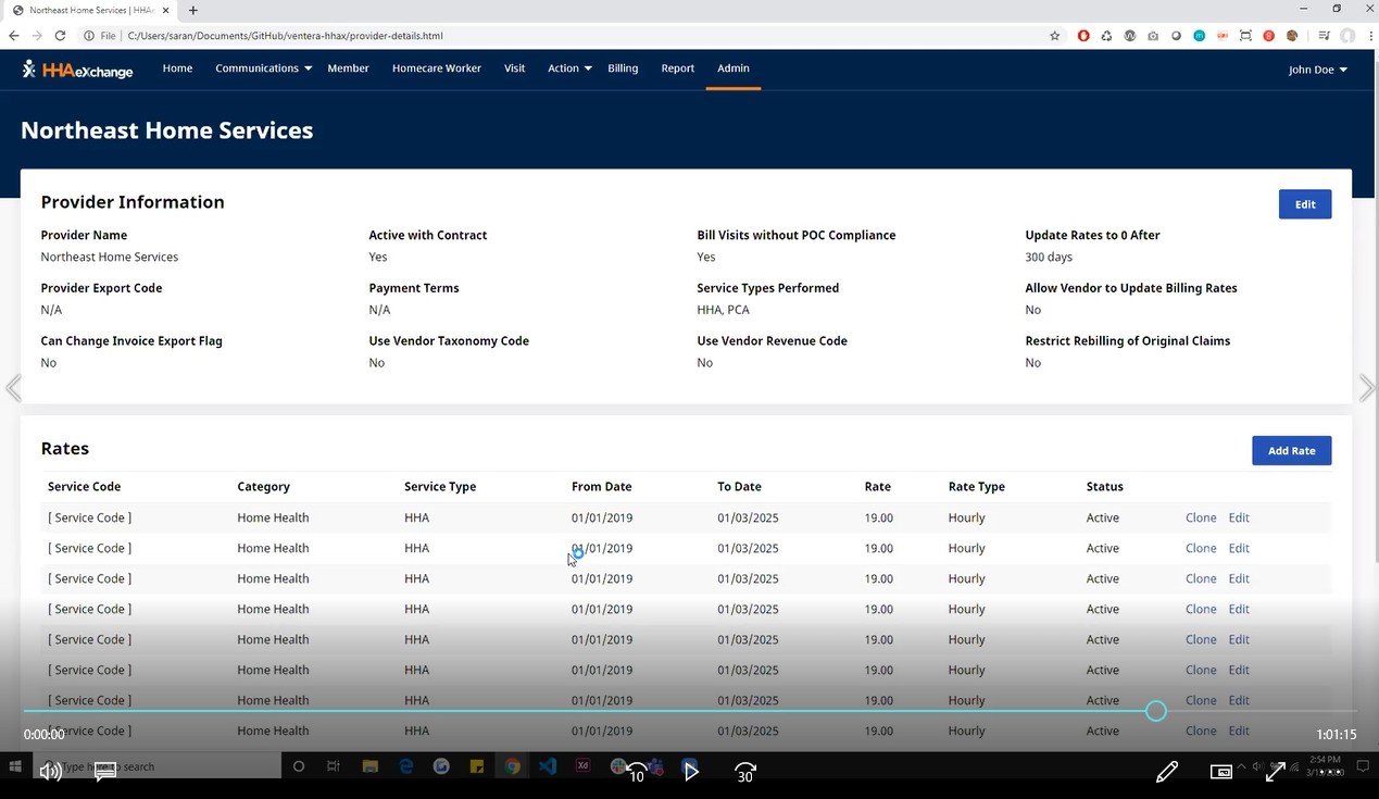
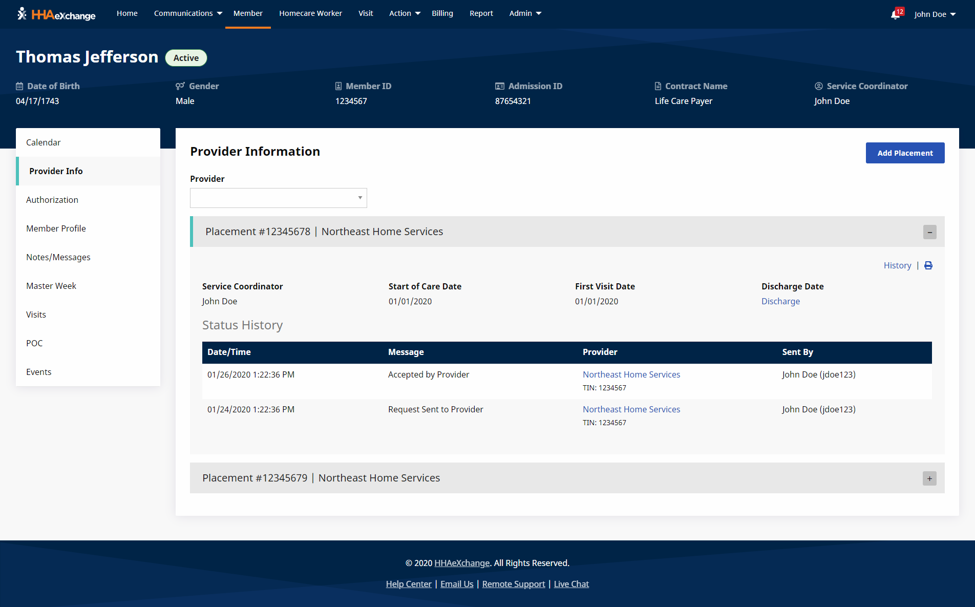
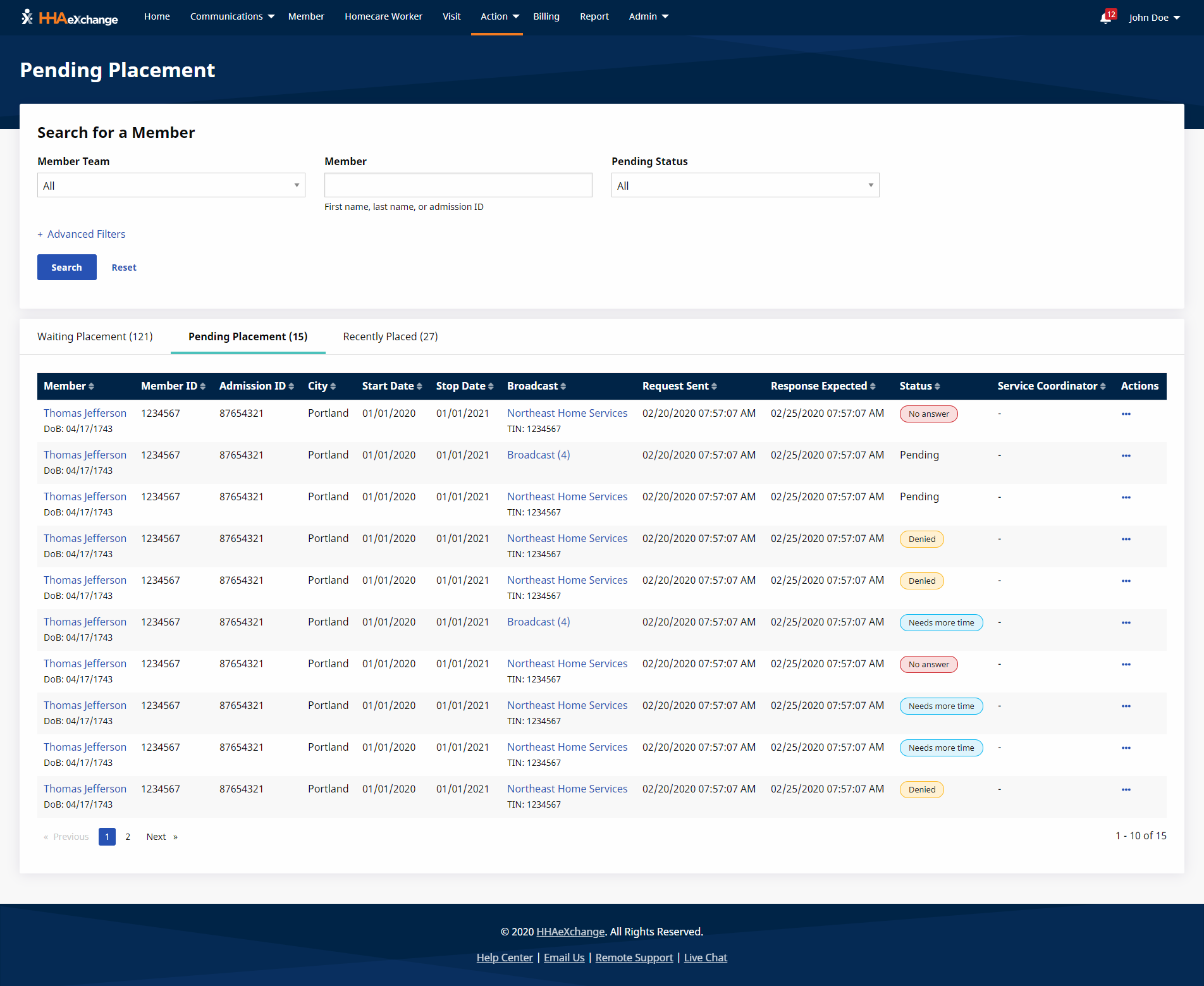
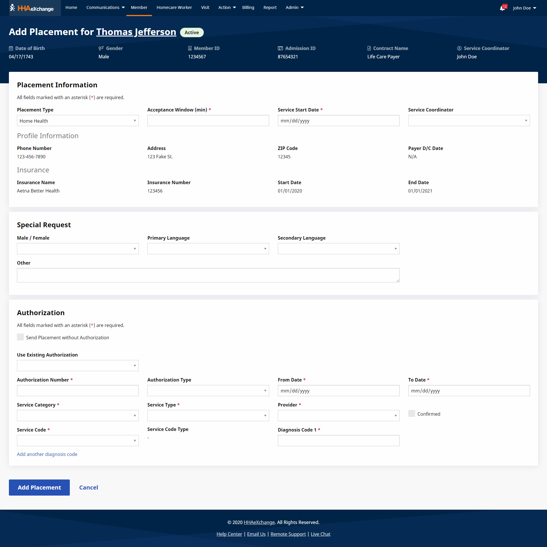
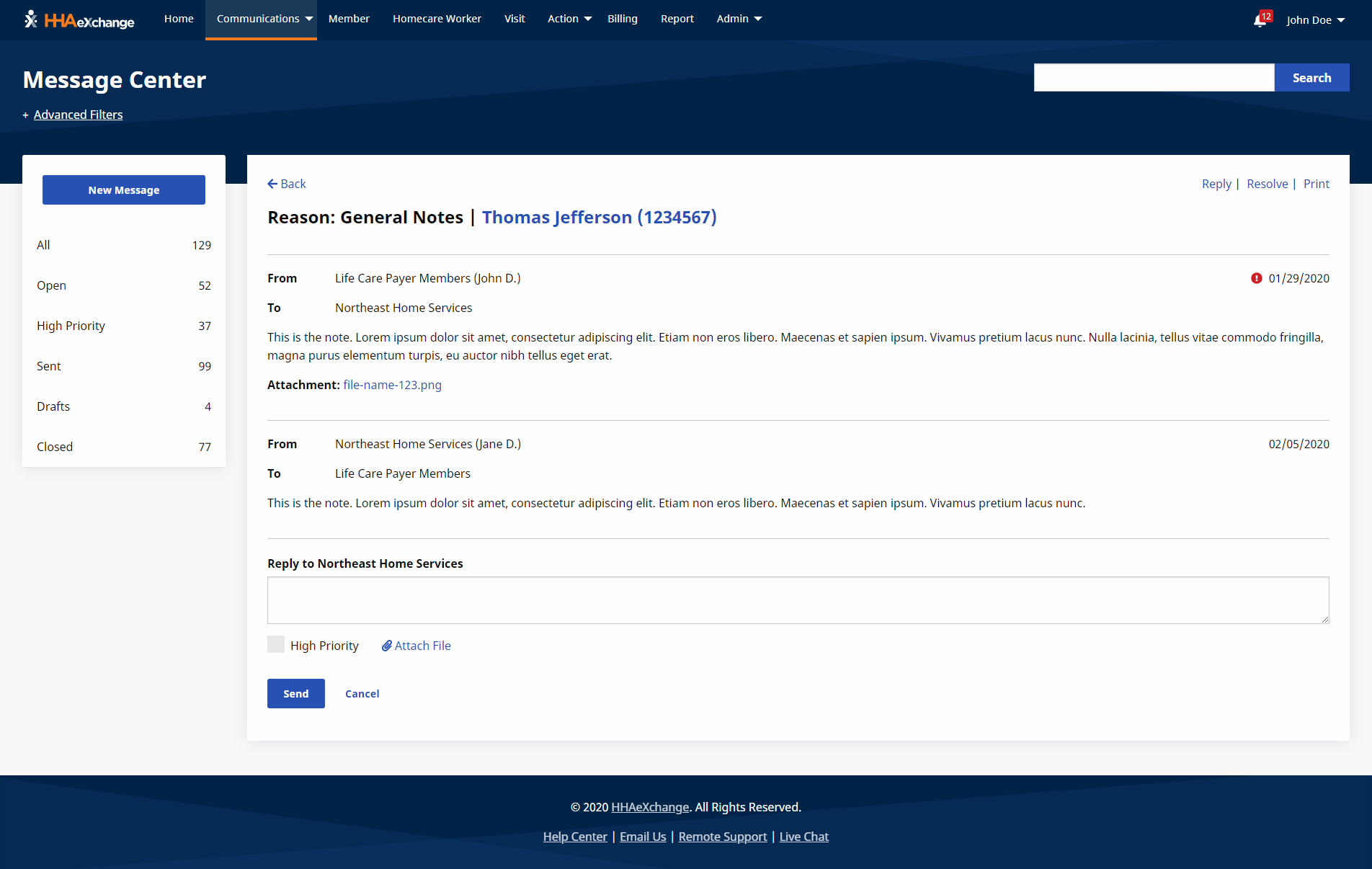
After user testing, we continued to iterate on the low-fidelity design. Once it was in a solid place, we started applying high-fidelity styles and prototyping the proposed design in HTML, CSS, and JavaScript. We chose Zurb Foundation as the front-end framework for its built in accessibility features. We hosted the prototype at a URL using Github Pages, so that the prototype could be viewable to anyone.
Testing the prototype
Once again, we tested the high-fidelity prototype with end users by providing the URL and asking them to perform tasks on the site. It helped us see how the design performed in a realistic environment, including things like browser choice and resolution. We used the user feedback to validate the design and make any final adjustments to the site.
Documenting personas
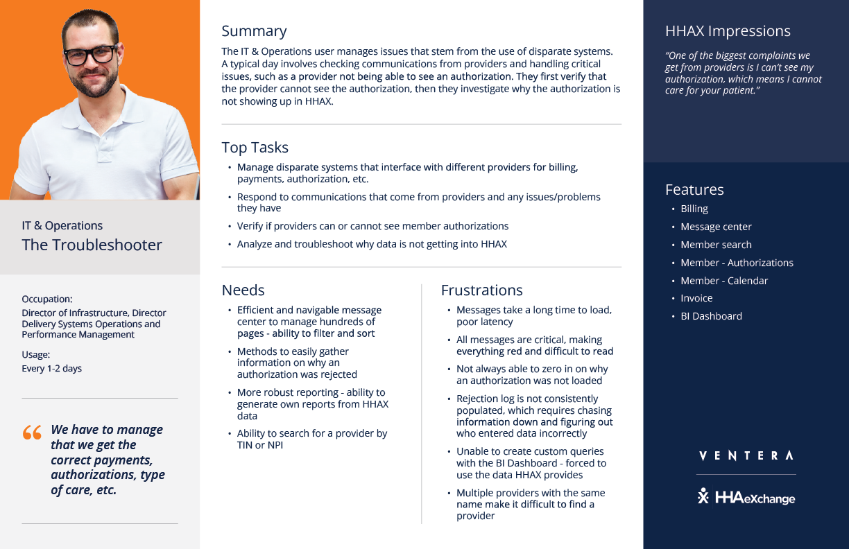
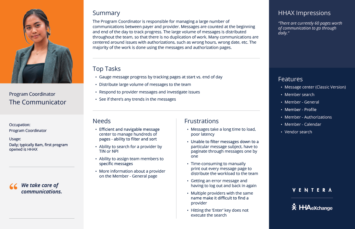
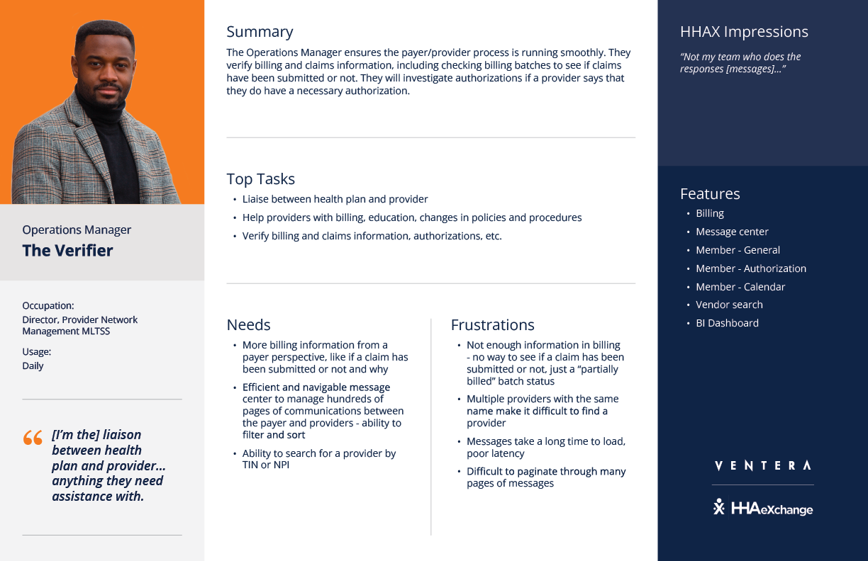
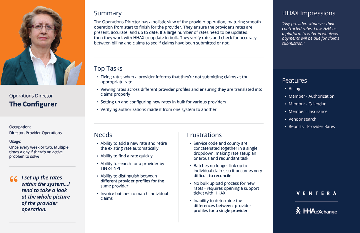
Throughout the project we defined and documented the application’s user types, updating our understanding with each user research initiative. Ultimately we produced 4 final personas for the client, which included information such as their archetype, summary, top tasks, needs, frustrations, and application features they use.
Establishing design standards
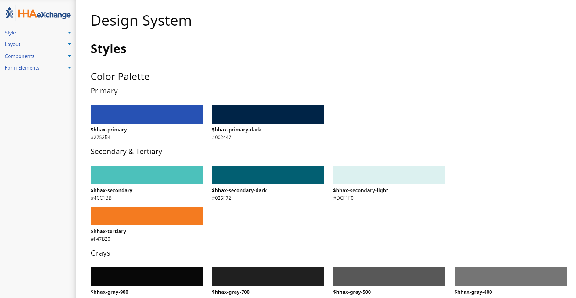
Throughout the design process the team was documenting components and styles for the design system. We delivered a coded design system along with the coded prototype. The design system is a living document that identifies all of the UI components and their usage, including sample code. It helps the developers to maintain design standards, keeping the UI consistent as new features are developed. View the design system
The final product
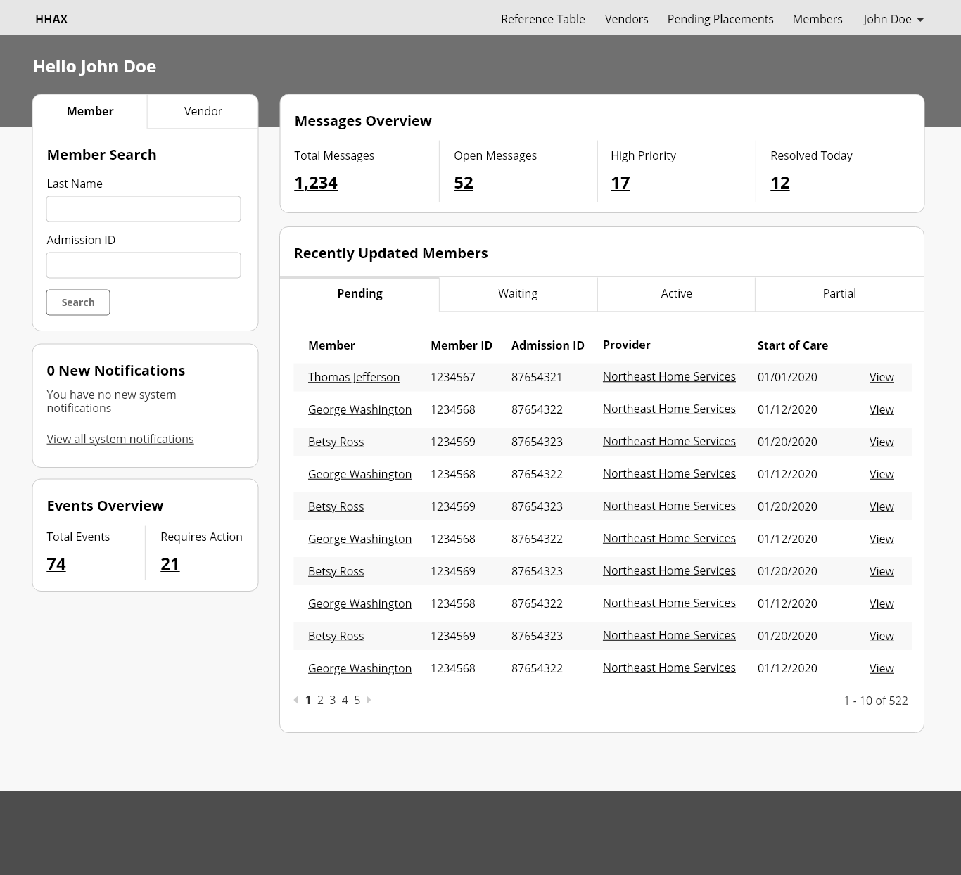
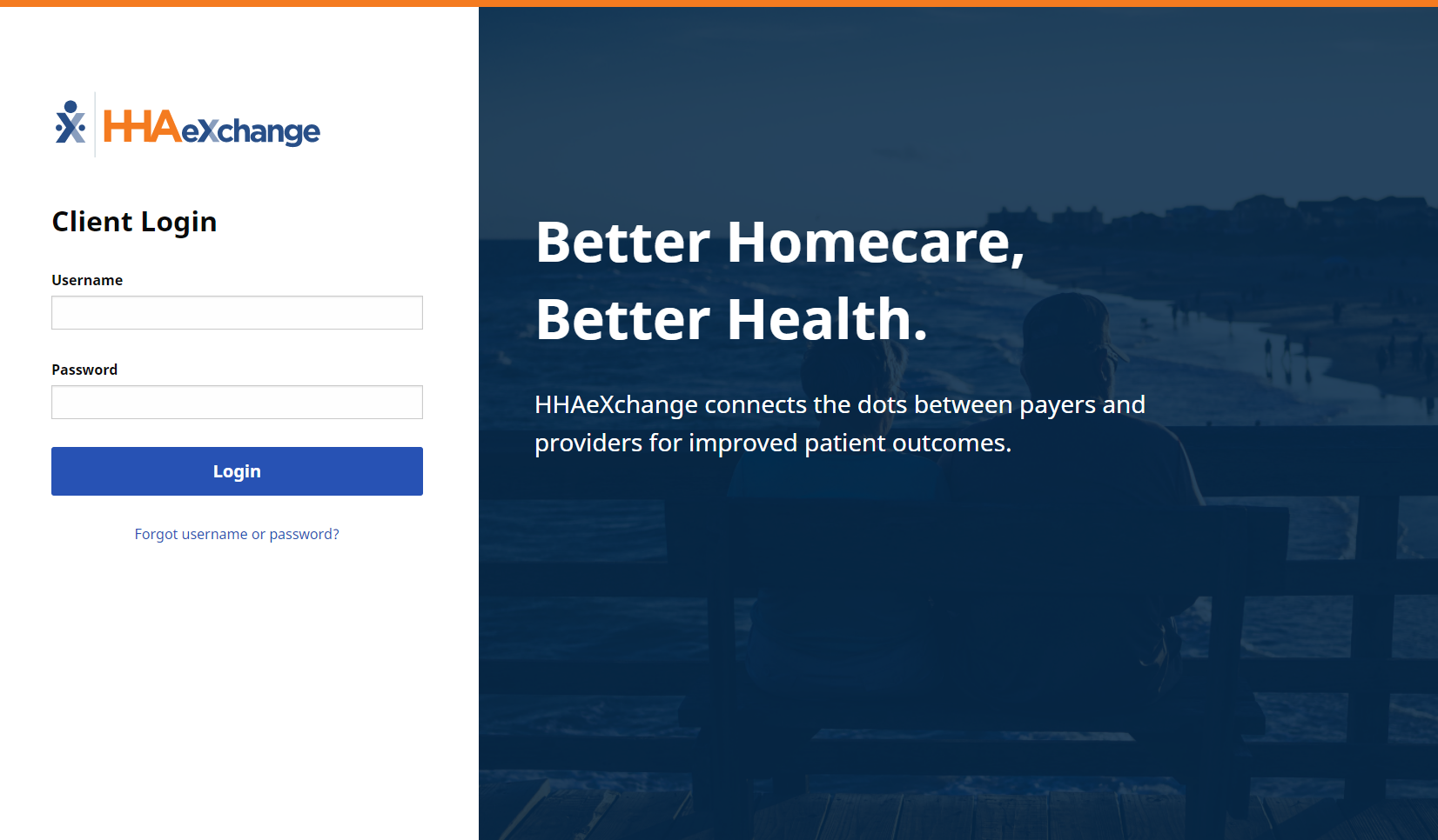
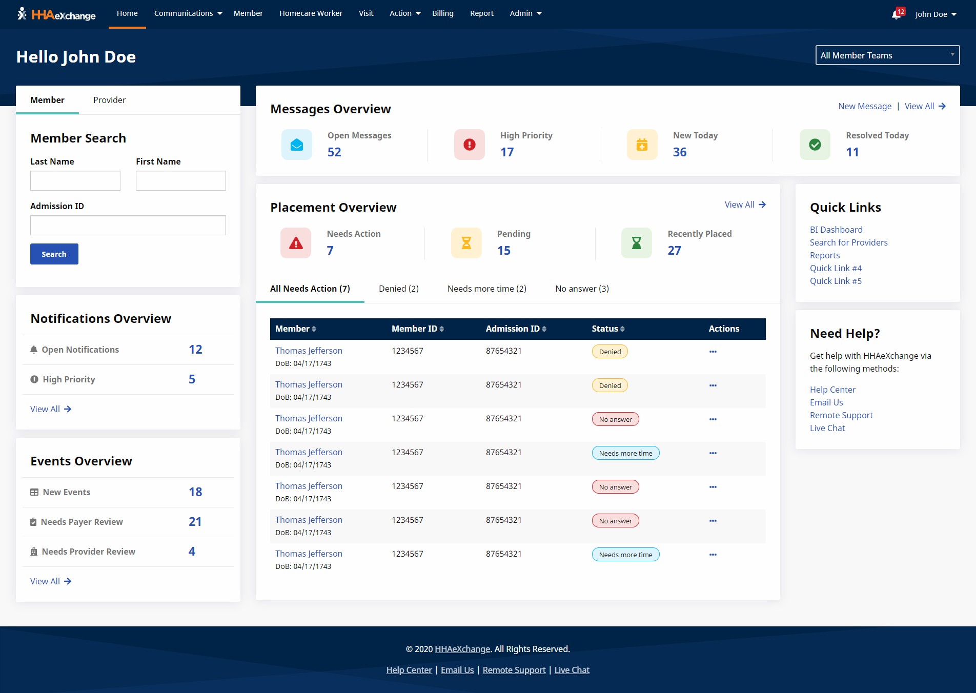
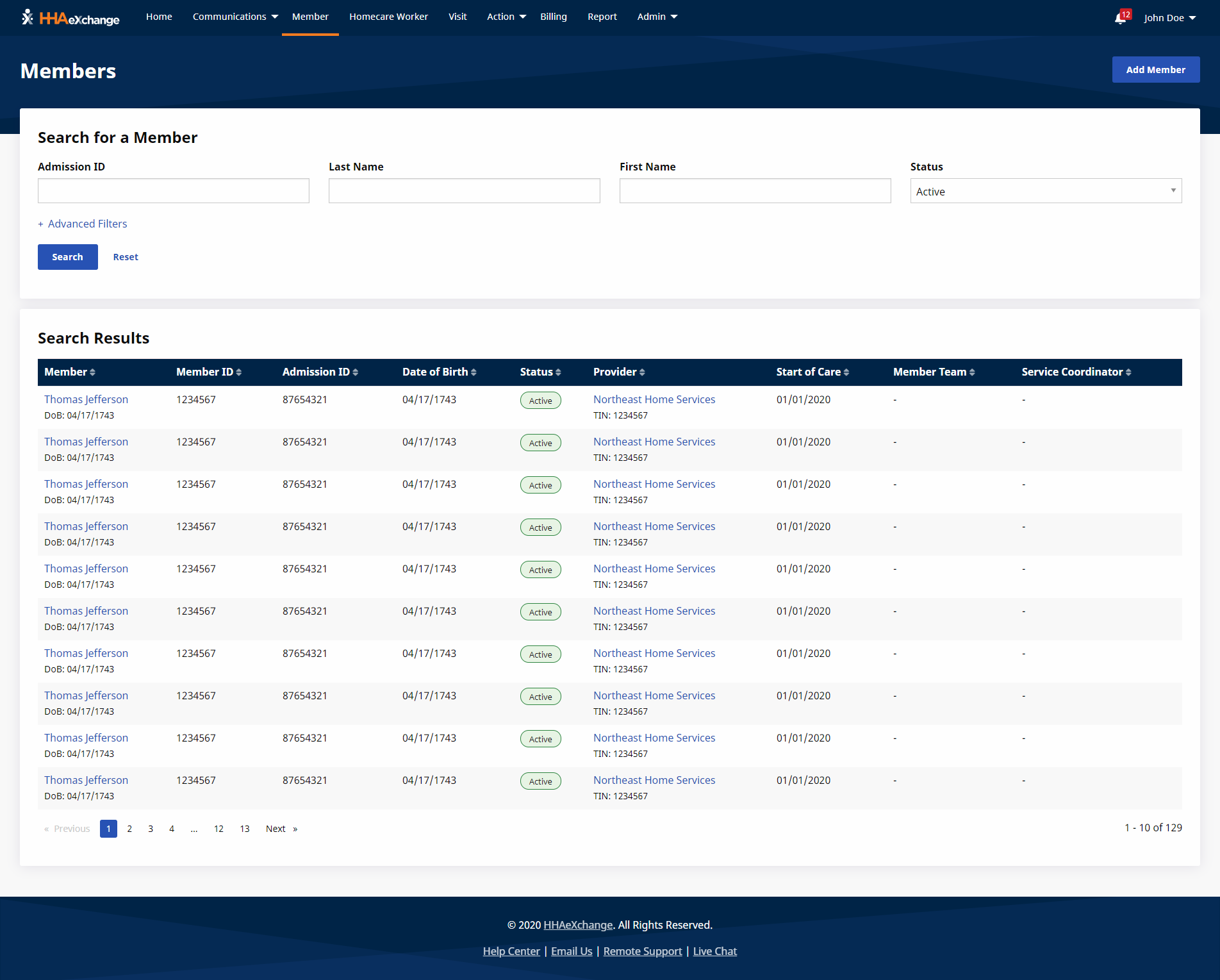
We added some final touches to the prototype and an accessibility expert tested our code for accessibility compliance. Ultimately, we delivered high-fidelity designs and UI code for 30+ screens on schedule. The final design was responsive, accessible, and brought the application into the 21st century. As the final step, we successfully handed off the UI code to the development team, making a very happy client.
Results and outcomes
- Redesigned 20+ screens
- Defined modernized UI standards via cohesive design system
- Developed 24 distinct UI components
- Reduced number of clicks for key tasks
- Produced development-ready UI code for application integration
- Responsive for mobile and accessible/508 compliant
