DataCentral Design Tokens
Role: Lead UI/UX Designer, UI Developer
Year: 2022
Company: Amazon – Business Data Technologies (BDT) organization
Technology: Figma, Figma plugin API, React, Typescript, Sass
The problem
DataCentral houses internal data products for Amazonians and is highly technical in nature. The platform currently uses the Katal design system, which was primarily designed for Seller Central and features teal styling. However, leadership wanted DataCentral to have a look and feel more closely aligned with AWS, which uses the Polaris design system (now known as Cloudscape) and is characterized by orange and neutral styling. As a result, our team was tasked with theming Katal to align more closely with Polaris while maintaining the underlying Katal system. This presented a significant technical challenge, as Katal lacked design tokens and only supported granular CSS overrides, making it difficult to efficiently and consistently apply broader visual changes across the system.
“Design tokens are all the values needed to construct and maintain a design system — spacing, color, typography, object styles, animation, etc. — represented as data. They’re used in place of hard-coded values in order to ensure flexibility and unity across all product experiences.” – Adobe Spectrum
The process
I owned and drove the theming of Katal for DataCentral by identifying 72 scalable design tokens, theming hundreds of components in the components Figma file, delivering detailed requirements to development, and conducting UXQA on the implemented theme. I wrote and coded the design token documentation, developing a Figma plugin to automate the color spectrum documentation, reducing development time from hours to minutes. I then extended the DataCentral tokens and contributed them back to Katal design system (used by Amazon’s Seller Central), theming hundreds of components in the Katal components Figma file with the new design tokens. I identified and fixed dozens of UI bugs in the Katal theme code and committed the changes to ensure the DataCentral theme was implemented as designed.
Here’s my overall process for defining the DataCentral design tokens:
1. Create color spectrum
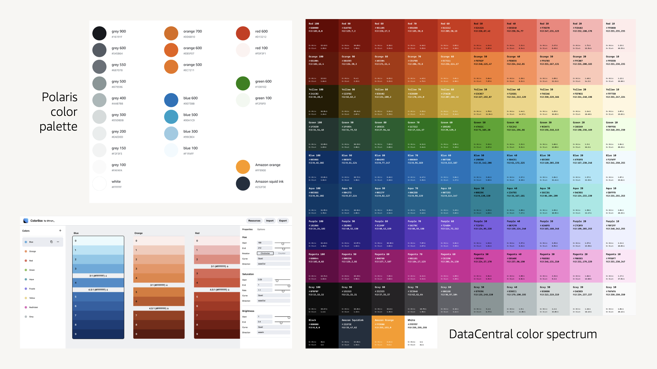
The first step in establishing design tokens for DataCentral was to create a complete color spectrum. The spectrum is based on the Polaris color palette; however, because Polaris does not currently expose its full color spectrum, we extrapolated a new, accessible spectrum that maintains the visual foundation of Polaris while providing a more comprehensive range of colors. This complete spectrum allows colors to scale in a logical and consistent manner across the system, which is particularly valuable for use cases such as data visualization. These colors serve as the global color tokens for DataCentral.
2. Identify color usage
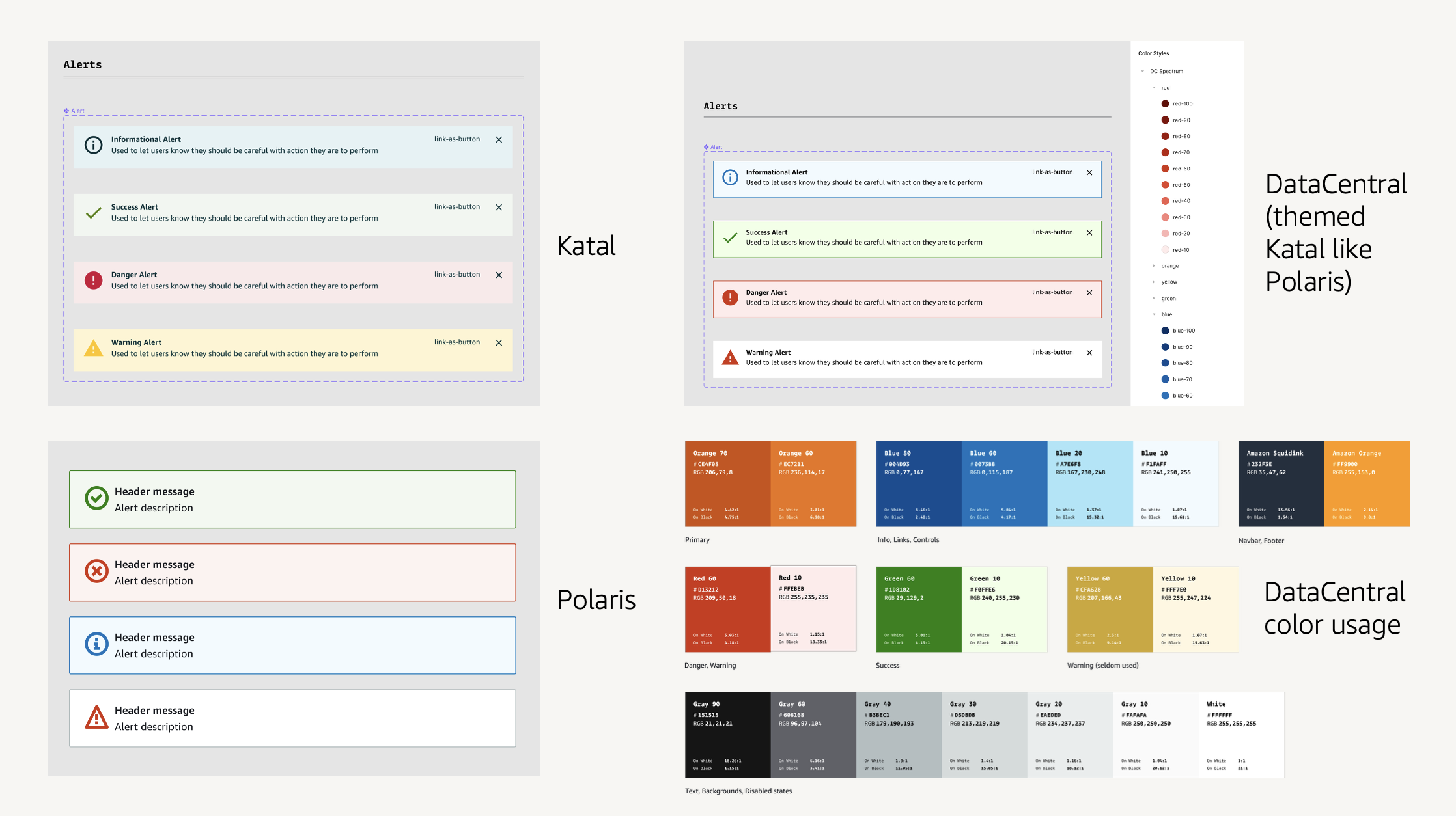
The next step was to identify the specific subset of colors from the full spectrum that we would actually use in DataCentral, since we wouldn’t need all 94 colors. We added the complete color spectrum to Figma and used it to style the Katal components to match the visual language of Polaris. For example, the illustration shows the existing Katal alert styles alongside the Polaris alert styles, followed by the DataCentral alert styles we created by applying the Polaris styling approach to Katal using the new DataCentral color spectrum. After applying this approach across all Katal components, we were able to identify the specific colors that are actually being used throughout DataCentral, as shown in the bottom right.
3. Establish alias tokens
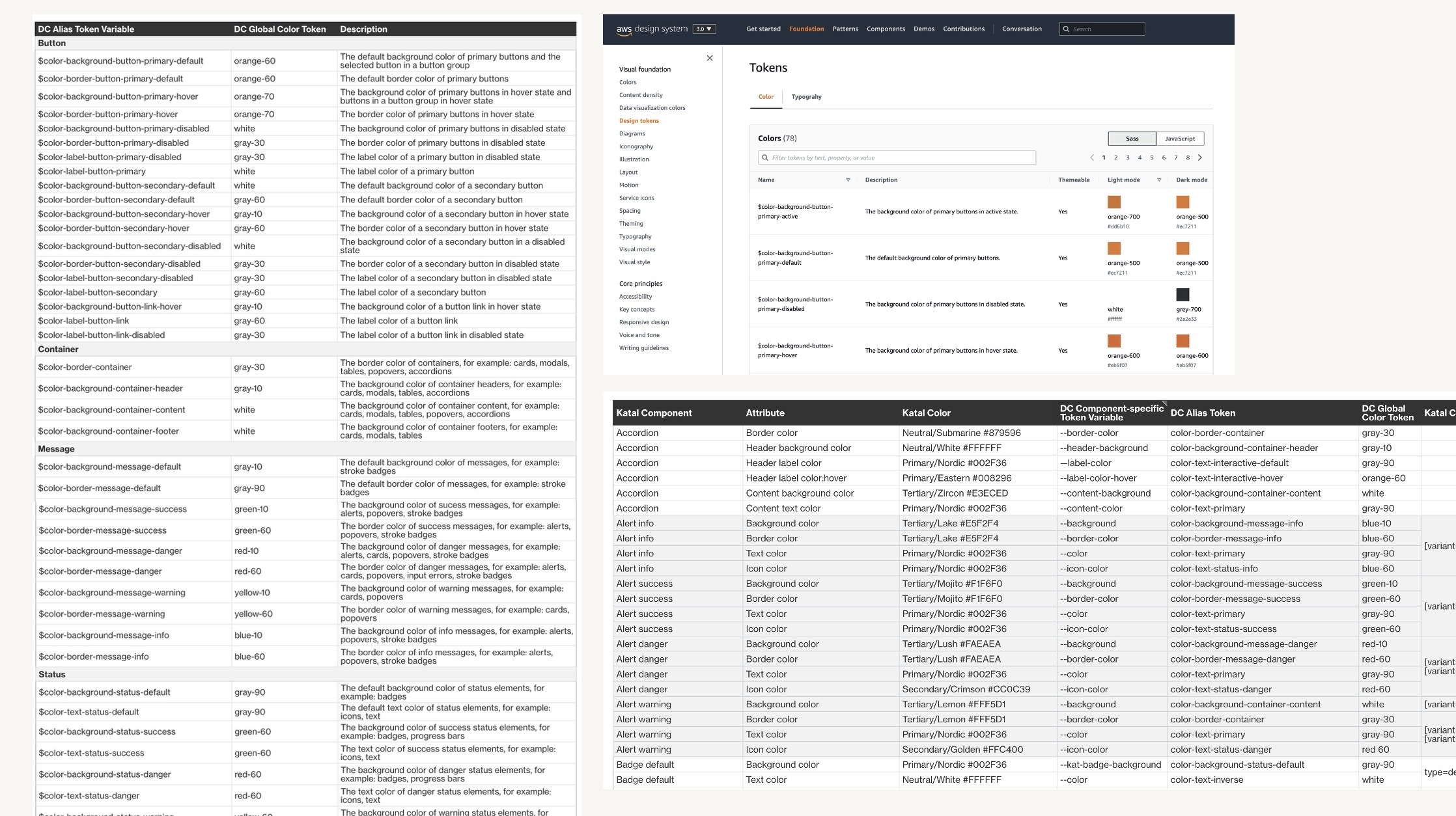
Once we identified the specific color usage across DataCentral, we analyzed common patterns in component styles to create alias tokens, also referred to as theme tokens. Each alias token is designed to be reusable across multiple components. For example, the color-background-container-content token can be used consistently across cards, modals, tables, and accordions. The goal was to establish the minimum number of reusable alias tokens needed to meet DataCentral’s styling requirements, with the flexibility to introduce additional tokens as the system scales. This approach makes it significantly easier to theme an application without having to update hundreds of individual styles. Once the alias tokens were established, we mapped them to the corresponding Katal components and handed the token definitions and mappings off to development for implementation.
4. Theme components
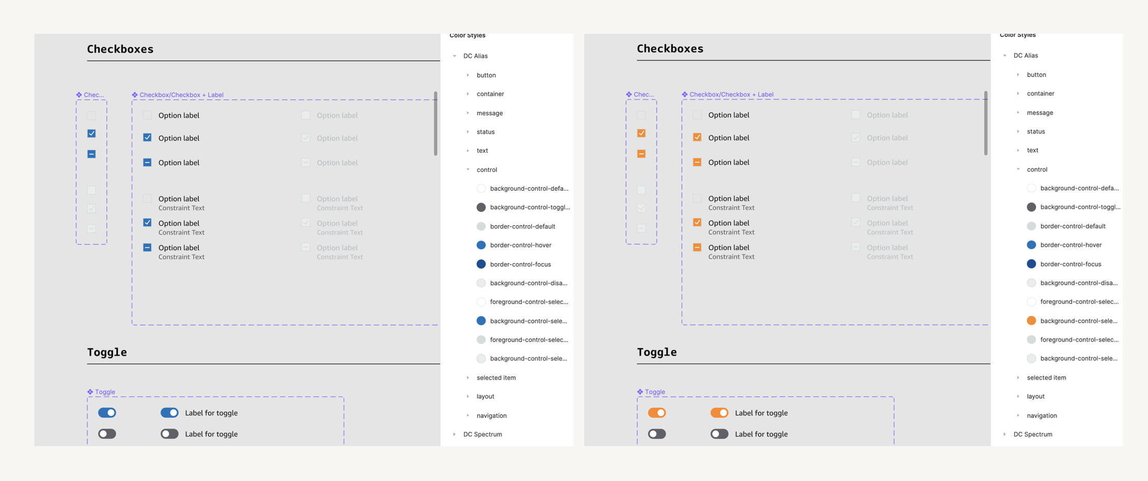
Finally, we added the alias tokens to Figma and used them to theme the components. This allows us to make global color changes across multiple components without having to update each component individually. For example, we can change the color of all selected form controls in just a few clicks without impacting other component styles. The same principle applies to code: alias tokens give developers the flexibility to easily modify existing themes or create entirely new color themes, such as a dark theme.
5. Document design language
As part of this effort, we also needed to document all of our design tokens on the DataCentral documentation site. Rather than manually coding the HTML for all of the global color tokens, I developed a Figma plugin to automate the process (demo below). The plugin allows you to select the color spectrum in Figma and automatically generates the corresponding HTML table. From there, you can copy and paste the table, or download or copy the raw HTML code. This automation significantly reduces the time required to document the tokens, turning a process that would take hours into minutes.
Here’s a demo of the DataCentral documentation site where we’ve been documenting the foundational design language work, as well as our components and processes:
The result
The DataCentral theme using the using the DataCentral design tokens and color palette launched in Q2 2022. The DataCentral design tokens enable a scalable visual design language for DataCentral, so that the application can have its own consistent look and feel built on Katal across different UIs. The design tokens also make it easy to make changes to the theme, so that only dozens instead of hundreds of styles need to be updated.
Outcomes
- Defined 72 scalable design tokens, visible to DataCentral’s 70k+ monthly unique users across the entire application
- Contributed DataCentral design tokens to Katal design system, used by Amazon’s Seller Central with ~10 million registered sellers
- Themed hundreds of components in the DataCentral and Katal design system components Figma files
- Figma plugin to generate color spectrum documentation saved hours of development time
- Detailed documentation provides transparency to teams in understanding how the DataCentral colors and theme were derived
- Fixed dozens of UI bugs in the theme code directly across 30 files (260 insertions, 224 deletions), ensuring design was implemented as intended