QualityNet
Category: UI / UX, Web Development
Role: Lead UI/UX Designer, UI Developer
Year: 2018 – 2019
Client: Centers for Medicare and Medicaid Services (CMS)
Technology: EJS, Angular, Node.js, Adobe Illustrator, InVision, OptimalWorkshop
Redesigning an outdated healthcare website
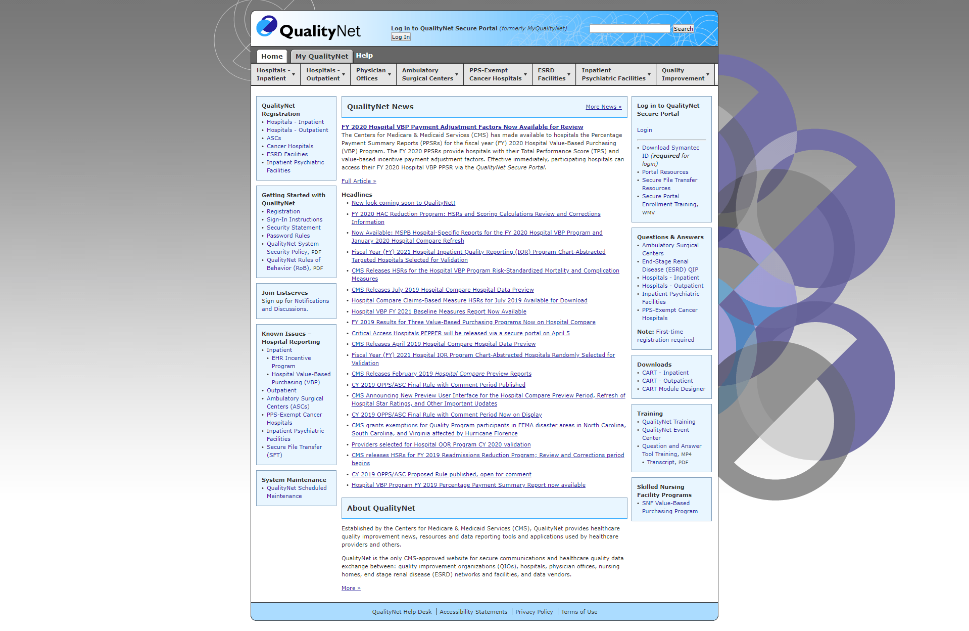
The QualityNet project used user-centered design to redesign an outdated public-facing CMS website that provides healthcare quality improvement news, resources, and data reporting tools to healthcare providers. The existing site contained hundreds of pages and thousands of downloadable files – it was over a decade old, didn’t pass accessibility standards, and did not scale well for growing content.
Initial site analysis
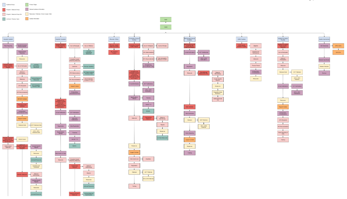
The first step to redesigning the QualityNet website was to analyze the existing site. The site contained hundreds of pages with a variety of content, so the analysis included documenting and categorizing every page on the site in a methodical manner. I created a site map to visualize the website’s hierarchy and gain an understanding of the existing information architecture.
Internal user interviews
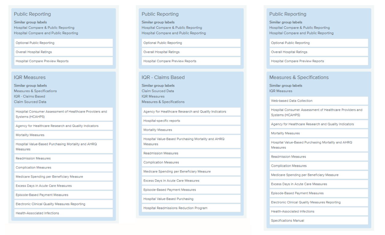
We conducted a series of user interviews with internal content contributors, the CMS contractors responsible for creating content for the QualityNet website. The interviews provided insight into the reasoning behind the existing content structure and areas for improvement. It also included a card sort activity in OptimalWorkshop that was used to help understand the users’ thought model for content organization. The redesign’s initial information architecture and site organization was directly driven by the card sort activity results.
Low-fidelity wireframes
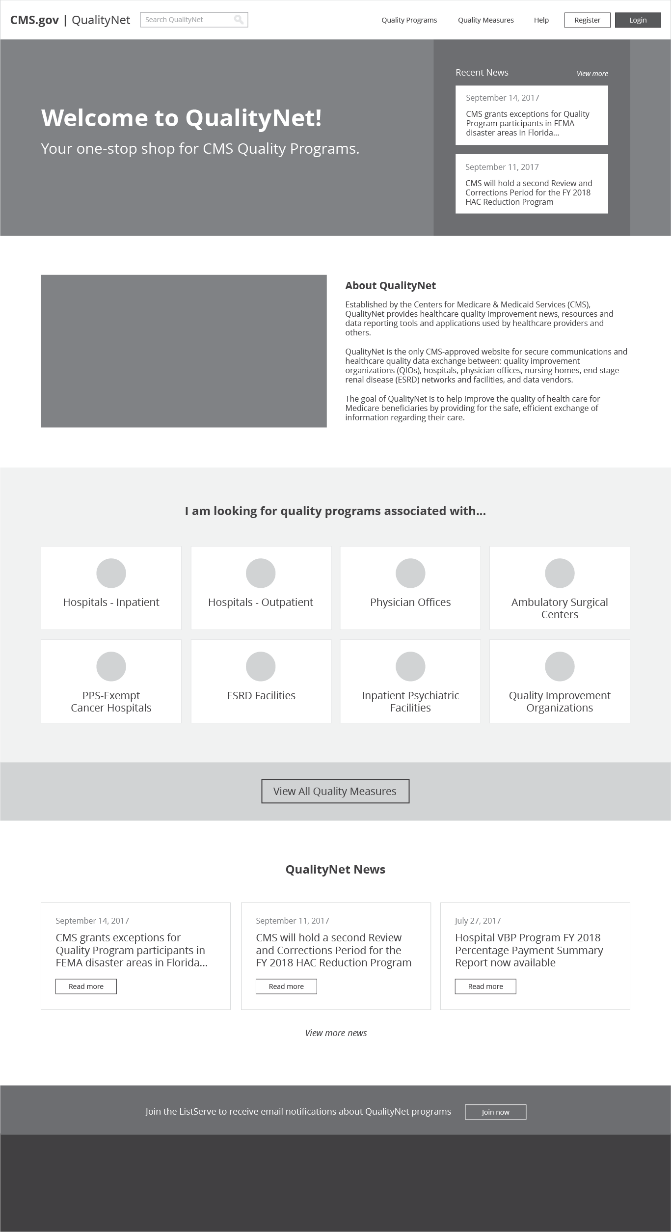
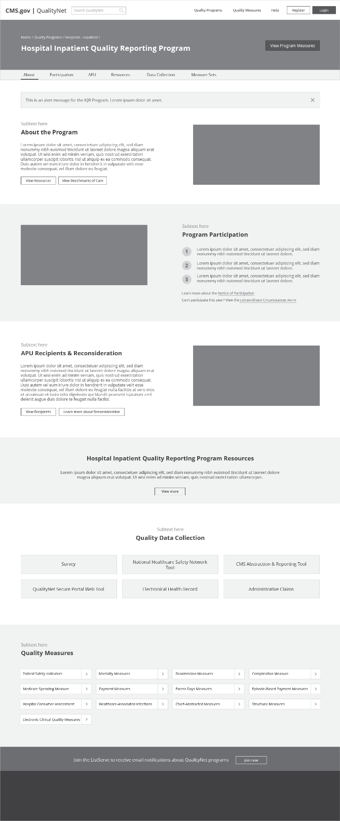
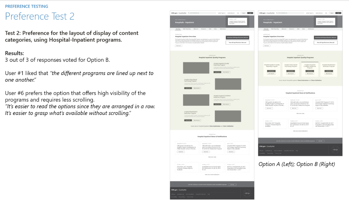
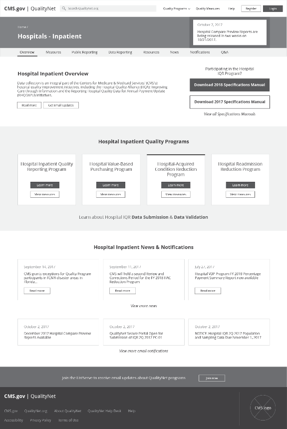
Based on the content contributor user research, I created and iterated upon on initial low-fidelity wireframes for the QualityNet redesign in Adobe Illustrator. The existing site analysis, internal user interviews, and card sort exercise drove the initial designs. The low-fidelity wireframes allowed for quick and iterative exploration in the early stages of design. Wireframes were added to InVision to create clickable prototypes that could be shared with the team and end users.
Wireframe user testing
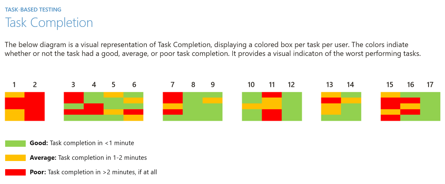
We created a clickable prototype of the wireframes using InVision to conduct task-based usability testing and A/B testing on the design with end users. The end users included hospital administrators that regularly accessed the QualityNet website and were responsible for submitting the facility’s quality reporting measures to CMS. Users were asked to complete a series of tasks on the wireframe prototype while we measured the task success. We also conducted A/B testing with potential designs that we were deciding between.
From wireframes to mockups
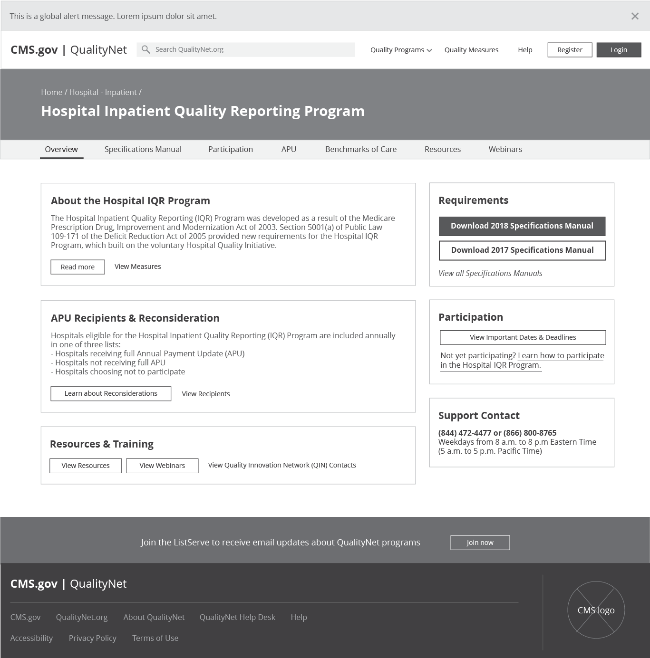
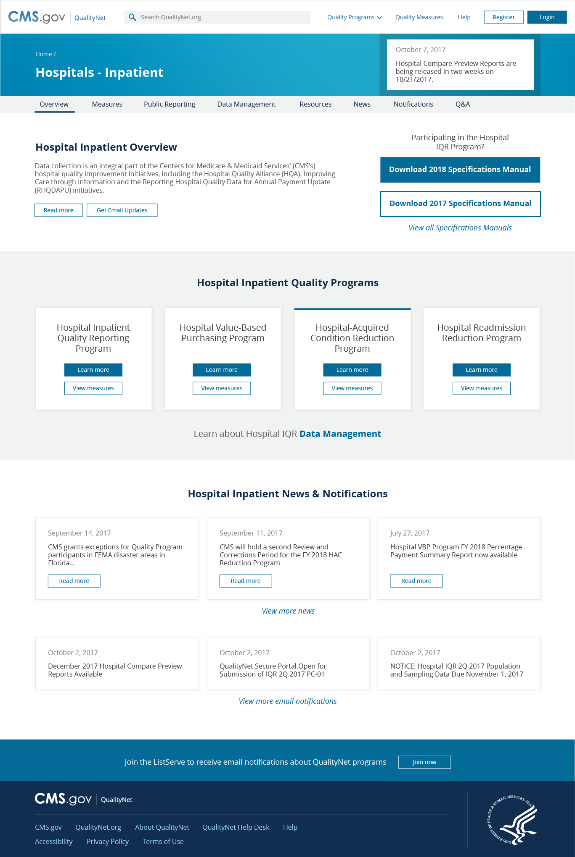
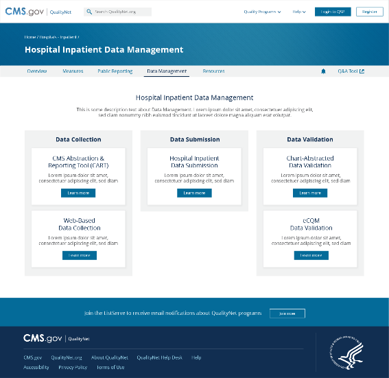
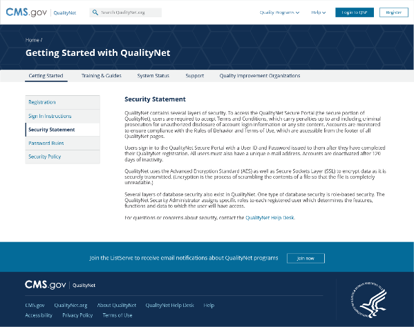
After the task-based usability testing, wireframe designs were iterated upon based on user testing findings. Wireframes were then transformed into high-fidelity mockups in Adobe Illustrator. The style of the website needed to abide by the CMS Design System, featuring patriotic colors, blocky appearance, and a stoic look and feel. The CMS Design System was created to encourage consistent branding across CMS applications.
Mockup usability testing
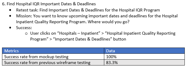
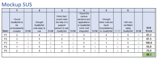
We conducted mockup usability testing with end users with the new high-fidelity mockups. The usability testing consisted of task-based usability testing and the System Usability Scale (SUS). We retested tasks that we tested in wireframe usability testing to quantify improvement to the design. The SUS was used as a quick and dirty method to provide a trusted overall usability rating for the proposed redesign. Overall, mockup usability testing helped to validate a more realistic version of the design direction.
Mockup iterations
Mockups were iterated upon based on the mockup user testing findings. Various styling options within the constraints of the CMS Design System were created, compared, and ultimately finalized.
Baseline user testing
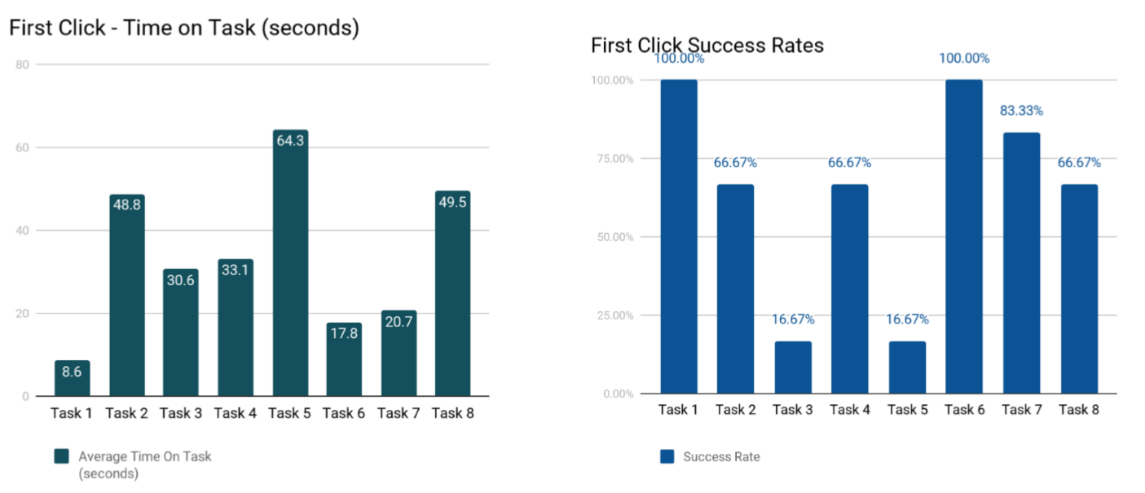
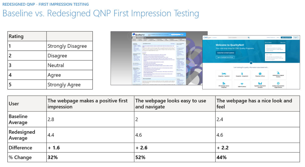
We conducted a final set of baseline usability testing and first impression testing on the existing site and redesigned mockups. The testing included a first impression test, first-click test, and moderated remote usability test. End users were asked to complete a series of tasks on the existing site to provide baseline metrics to compare against for any future user research. Users completed a first impression survey for the existing and redesigned sites to inform quantitative improvement. See the full Baseline User Testing Findings Report
Migrating and building the site
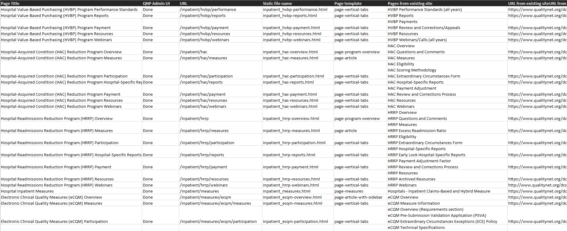
Once the design was finalized, I coded the QualityNet website UI and migrated/reformatted content from the old site to the new site. I determined how it would be implemented on our headless content management system by identifying content types, content type metadata, and page templates. The content management system is Angular-based and dynamically renders the public site via EJS page templates so the content fields are customizable and easily editable by a non-technical content manager. I identified and mapped all of the necessary page templates, coding all of the EJS page templates and formatting them so they were consumable by the content management system. Once the organization and structure of the site were set up, I spent a couple weeks building the new QualityNet on the content management system from the ground up.
The final redesign
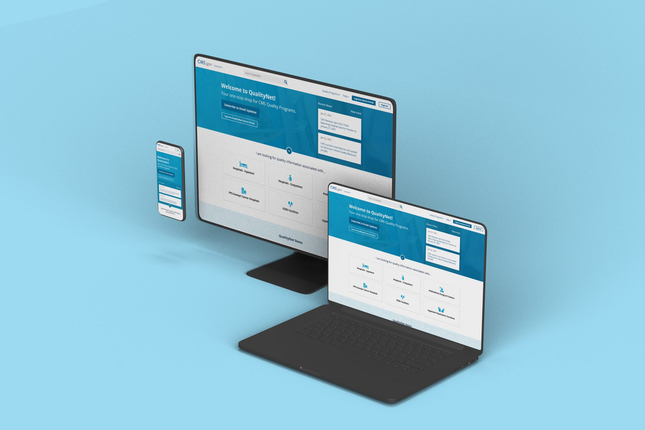
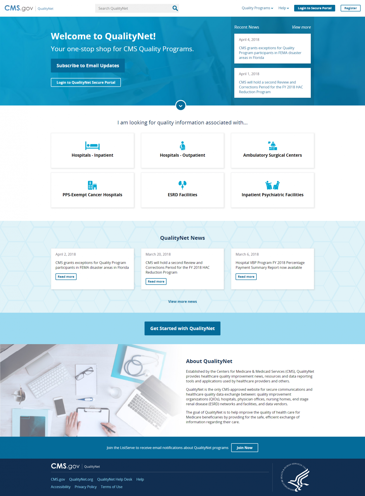
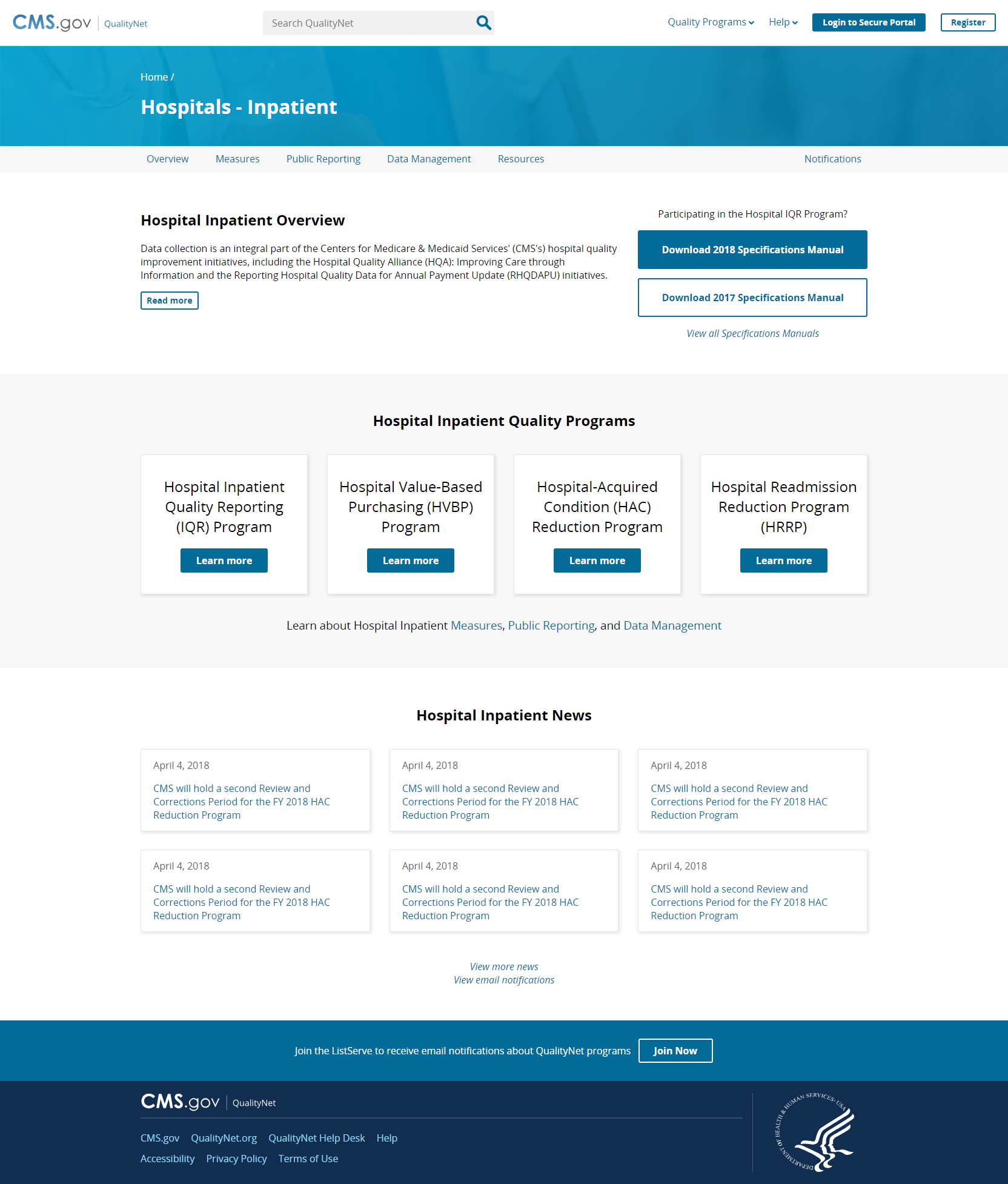
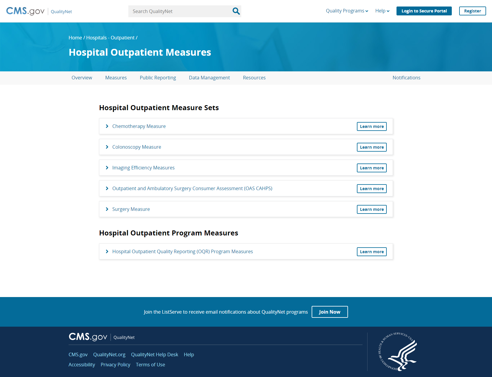
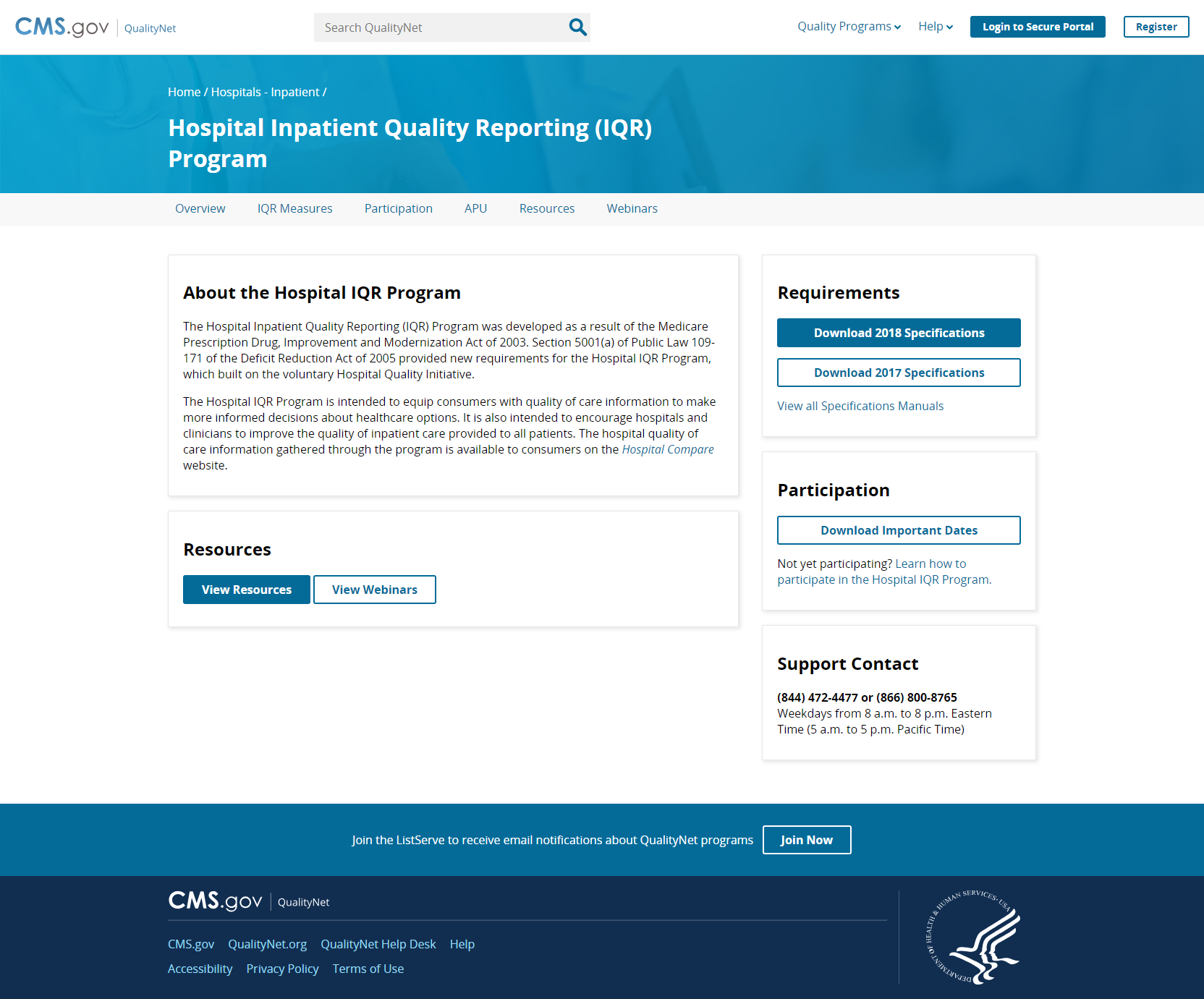
The redesigned QualityNet was successfully deployed in September 2019 and receives millions of hits a year. Improvements to the site include faster performance, updated look and feel, simplified and scalable navigation, responsive design, increased accessibility/508 compliance, and more. The redesign involved many iterations of low-fidelity wireframes to high-fidelity mockups and multiple rounds of user testing. The final design matches modern CMS branding and greatly improves the site’s overall usability.
Results and outcomes
- Supports 100k+ provider users and receives millions of hits a year
- >40% improved first impression score
- 68% improved System Usability Scale score
- >50% faster performance/page load speed
- Simplified and scalable navigation for growing content with improved site IA, organization, and readability
- Modernized look and feel with CMS branding
- 14 different page layouts and more user-friendly URLs
- Improved consistency across provider types/programs for easier learnability
- Framework enabled 48 hour concept to production enhancements for COVID-19 Acute Hospital Care at Home emergency project
- Reduced time for content manager to create new pages/content and upload files from days to minutes
- Cost savings by no longer paying Oracle for FatWire content management system
- Improved security by replacing an unsupported and vulnerable FatWire
- Responsive for mobile and accessible/508 compliant
