CMS Data Repository Tool
Category: UI / UX, Web Development
Role: Lead UI/UX Designer, UI Developer
Year: 2021 – Present
Client: Centers for Medicare and Medicaid Services (CMS)
Technology: Angular, Node.js, Adobe XD, InVision, OptimalWorkshop, Miro
Redesigning a two decade old system
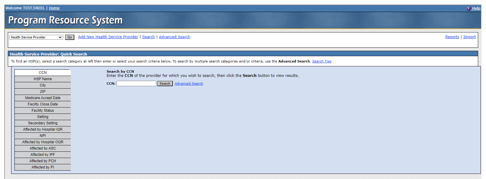
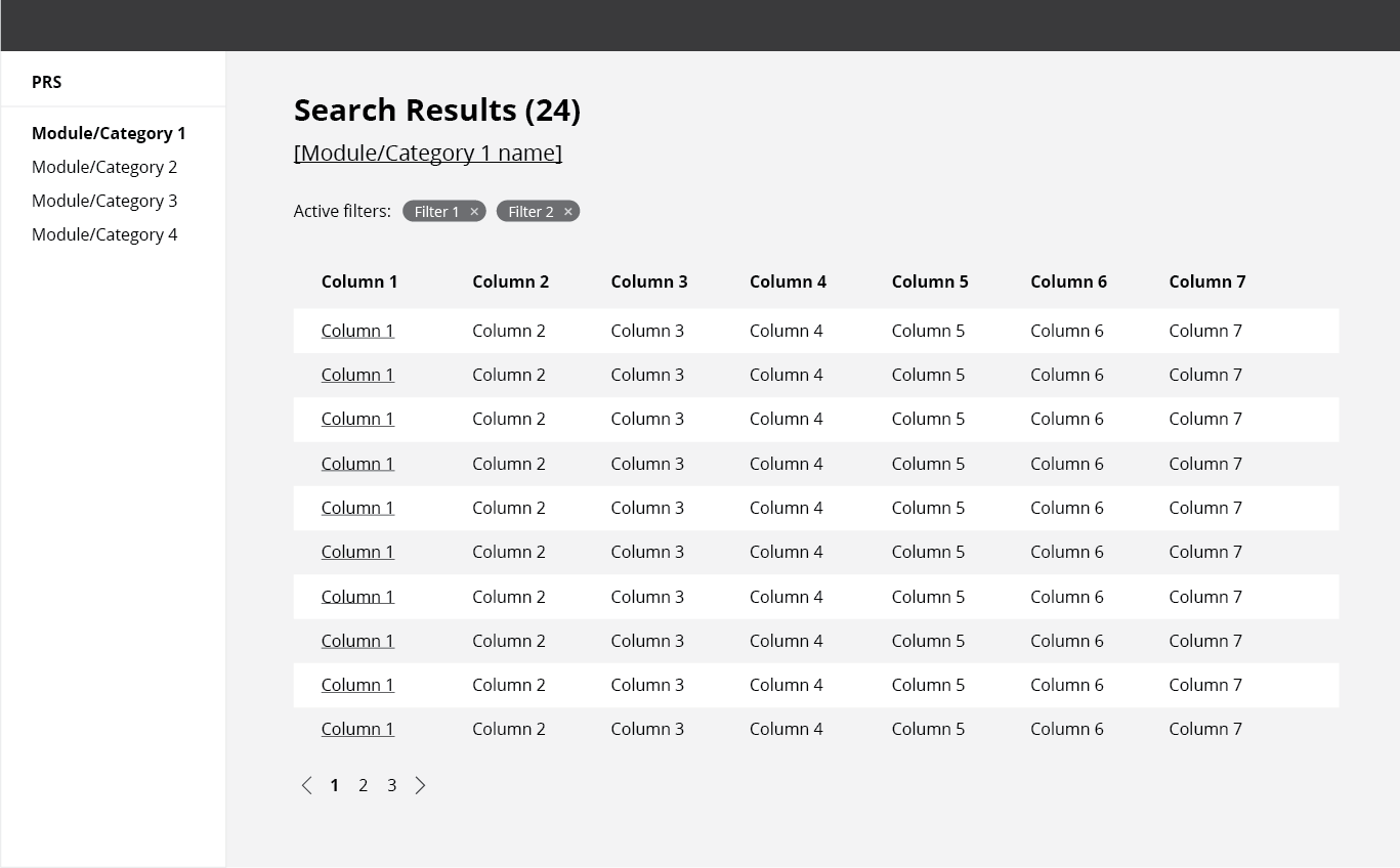
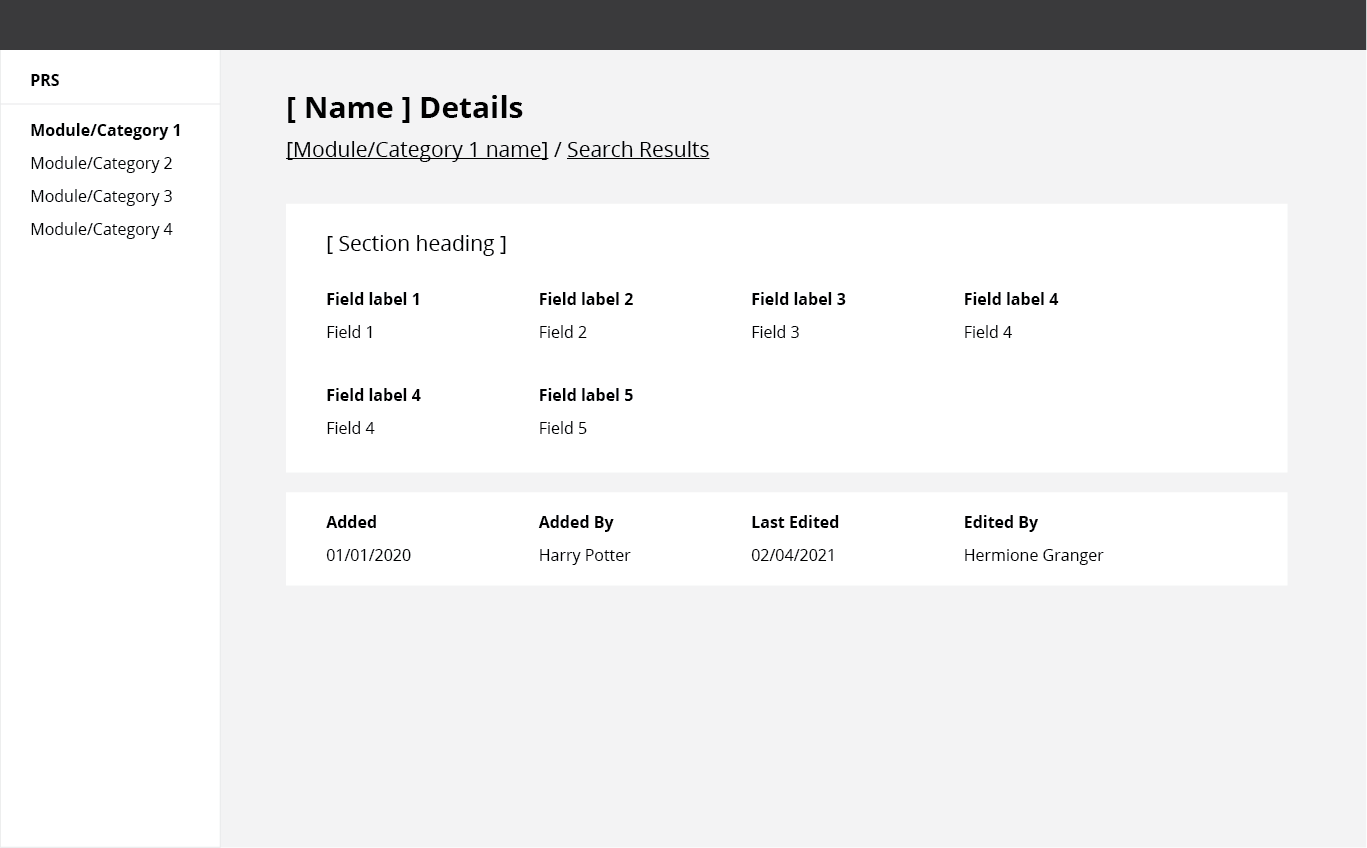
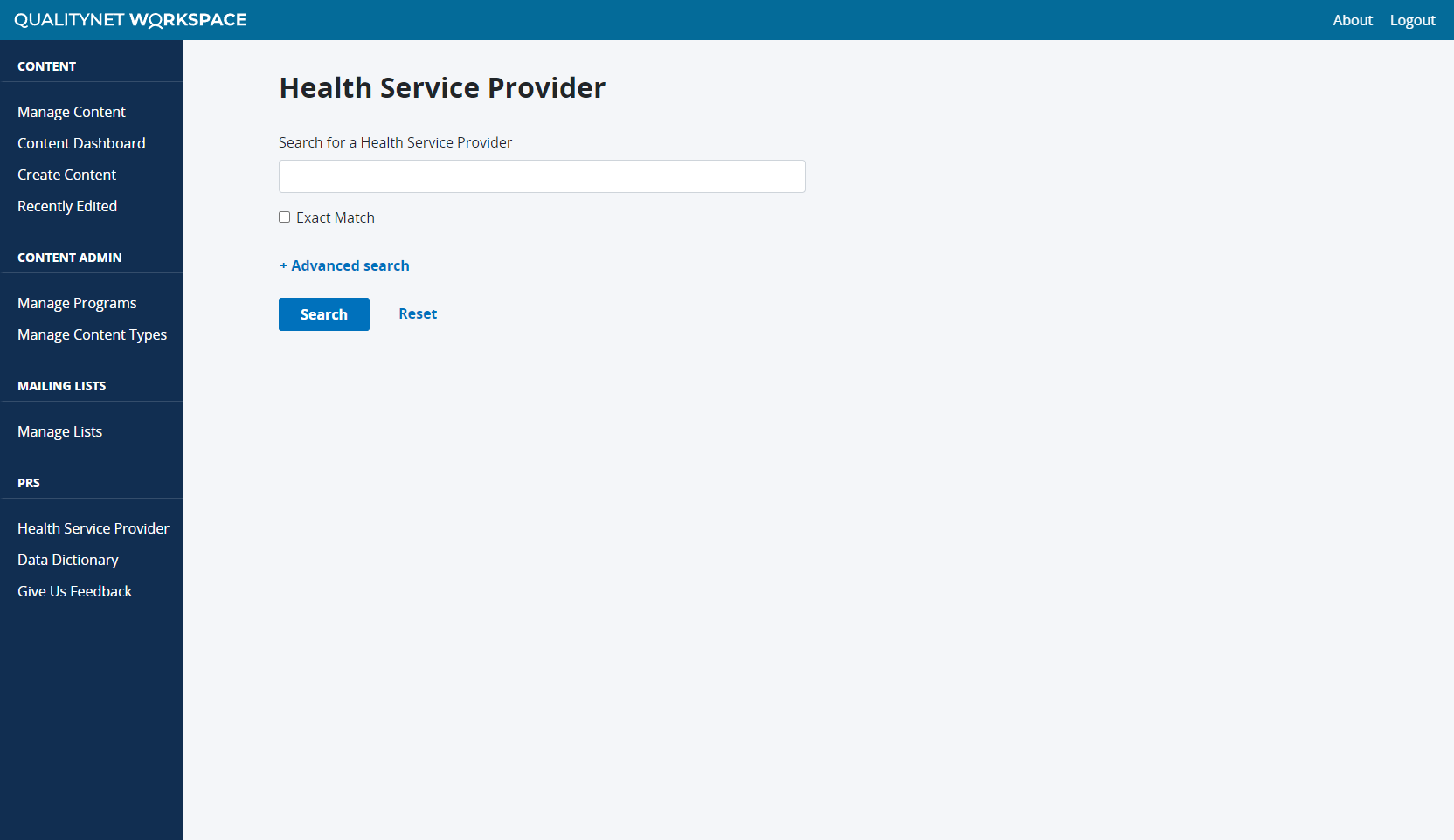
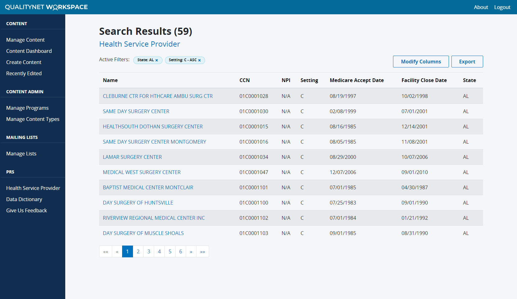
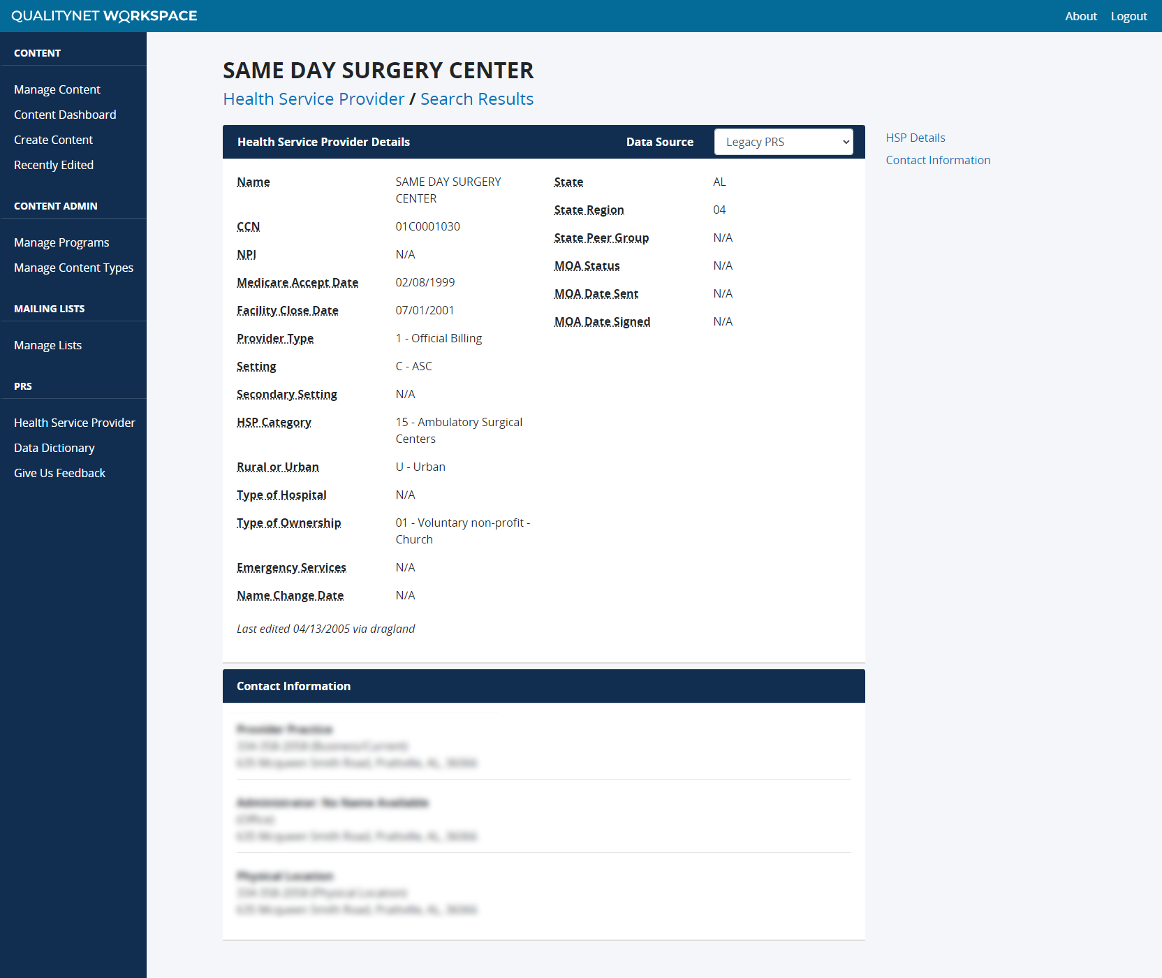
The purpose of this project was to redesign an internal, legacy CMS application that serves as a repository of demographic information for providers in the CMS system. It compiles data from a variety of CMS data sources, including Health Service Provider, Beneficiary, Medicare Advantage Plan, and more. The tool assists internal CMS contractors in maintaining CMS programs and providing information used in other downstream systems. Users can search data by category and view associated search results and details.
If this project it had a motto, it would be “we don’t know what we don’t know.” One of the biggest challenges with this project was the lack of a subject matter expert (SME) on the tool. Many different groups and teams knew a piece, but no one knew the full picture or current use cases. Our team was tasked with researching the tool and becoming subject matter experts on the legacy system, so we could provide recommendations and define a Minimum Viable Product (MVP) for the redesign.
Discovering what we don’t know
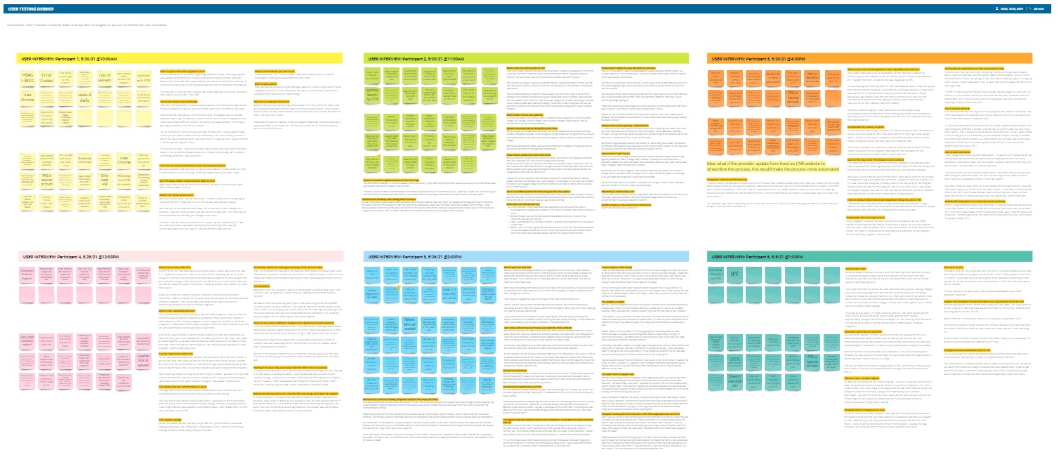
After evaluating existing documentation, we started our research with a series of user interviews with the primary user groups. 13 user interviews were conducted across 4 user groups to get an initial understanding of who the users are, how they use the system, and how often. The user interviews were incredibly informative and helped to define the initial personas and primary use cases for the system. From there, we got a better understanding of which features we should develop for the MVP release of the redesign. Through our initial discovery and user interviews, we learned that there were two main problem statements we wanted to improve in the new system.
- Improve the data accuracy by streamlining backend data flows
- Modernize the site to improve the overall usability and user experience
Creating initial designs
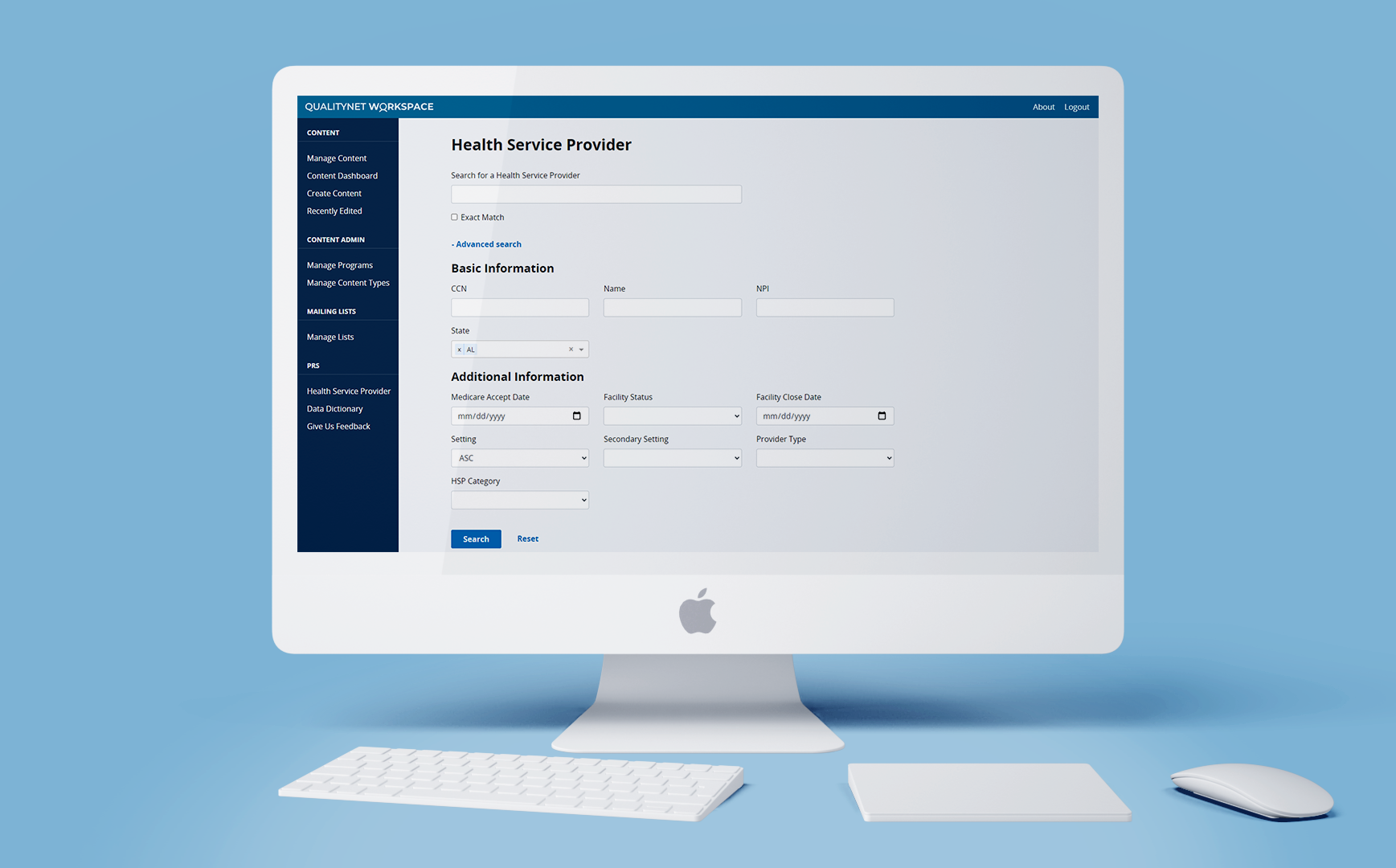
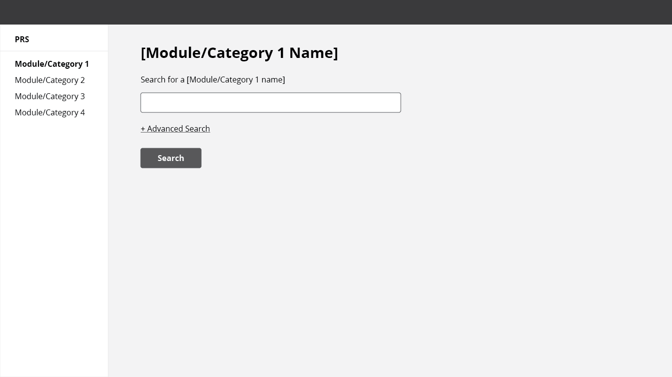
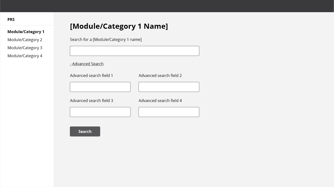
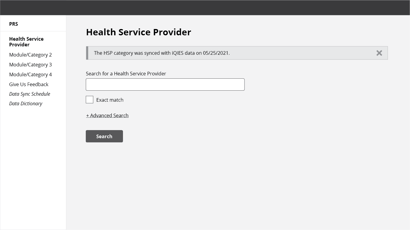
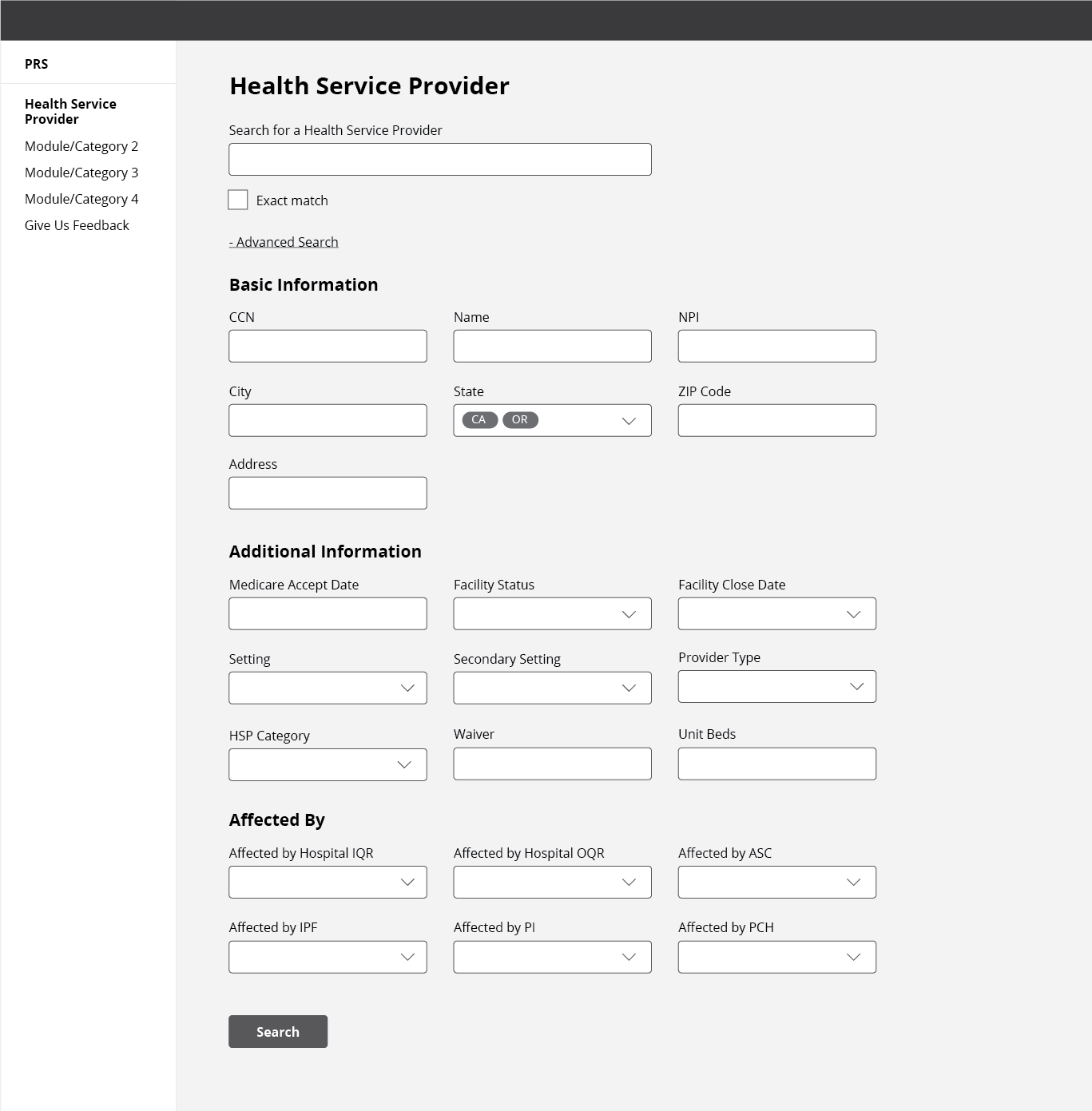
After the user interviews, we started creating the initial wireframes. The overall UX of the application is not very complex – it’s essentially a search, search results, and view details. However, the legacy system had a clunky advanced search and was overall an old system. For example, states had to be added to the search one by one, so to add 5 states it would take 15 clicks. Wireframe iterations introduced standard form design principles, such as making the state selection a multiselect dropdown so that adding 5 states takes 6 clicks.
Investigating the data flow
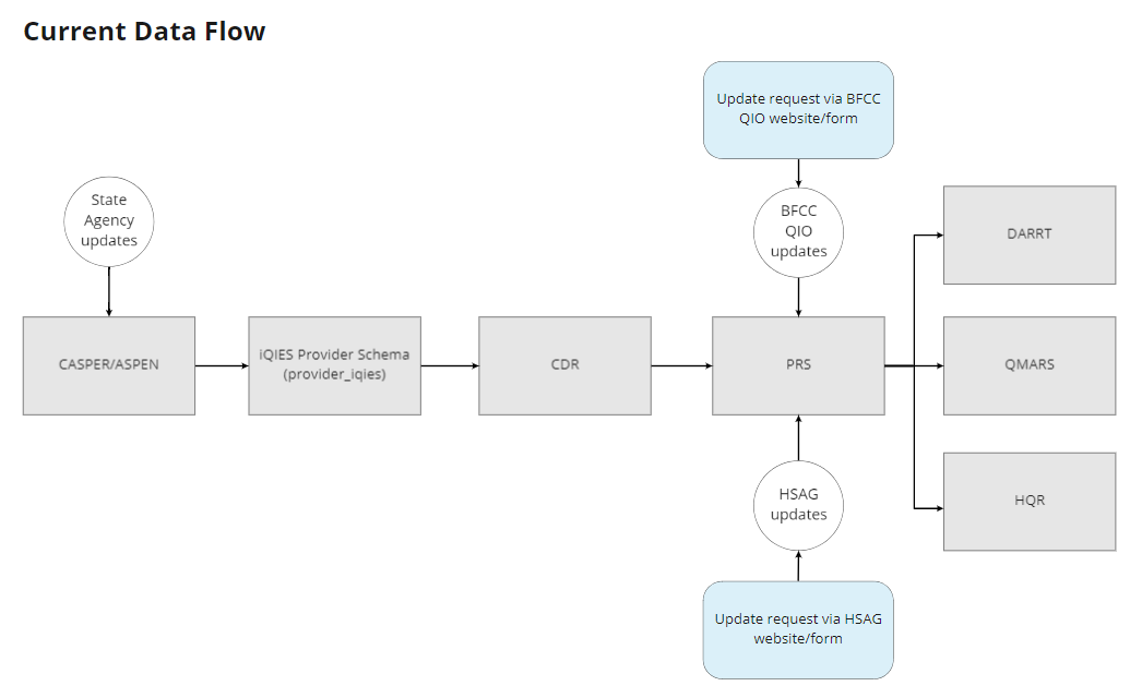
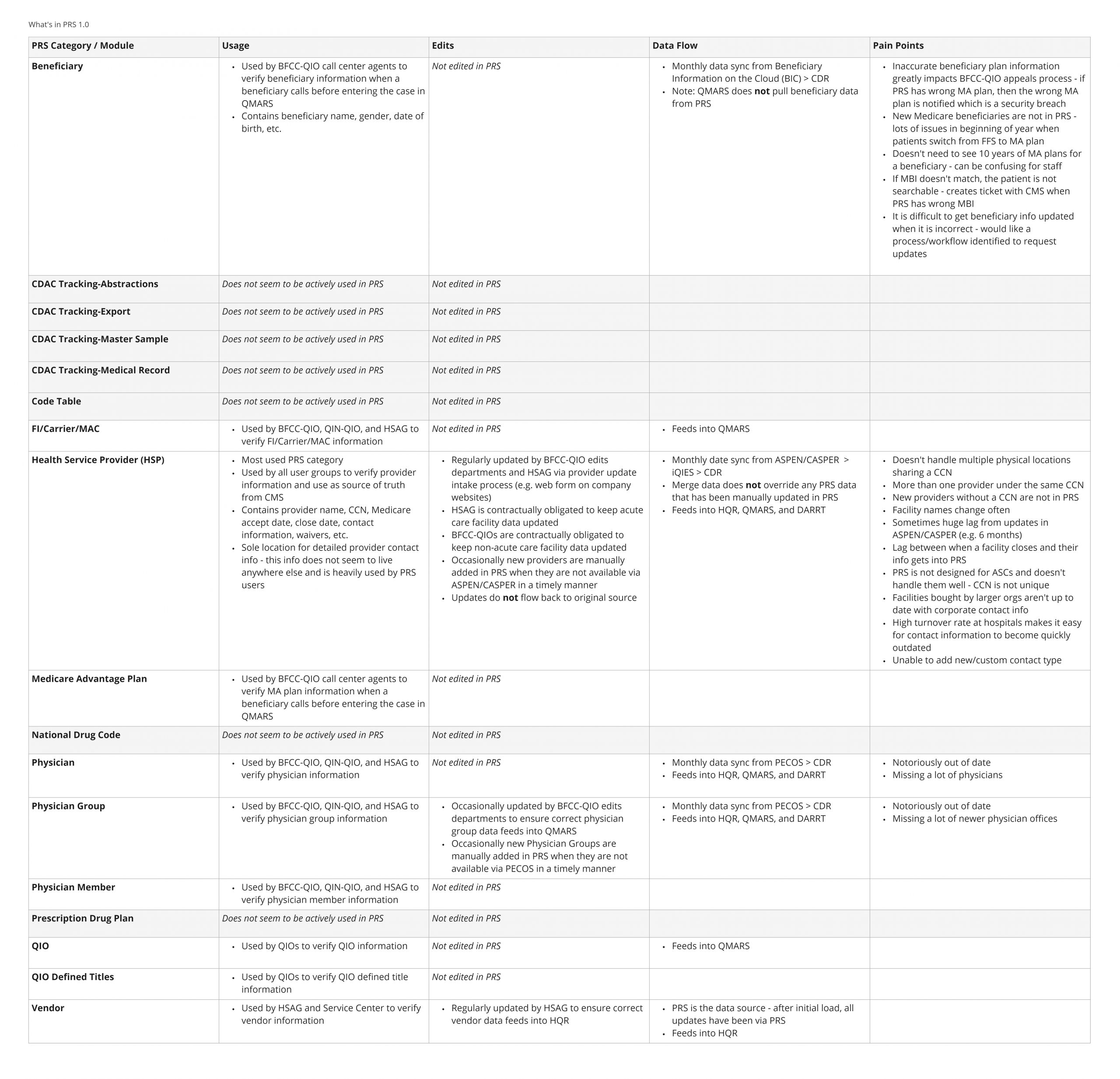
This project required research not only on the UI/UX side of things, but a lot of research on the backend data flows as well. In order to fix the data flow issues, we had to understand how and what data moved from the various upstream CMS data sources to the system to further downstream systems. We found that edits made in the system did not flow back to the upstream data sources, resulting in out of sync data across various CMS systems. Between the two problem statements, the UX issues are much easier to fix than the data flow issues.
Quantifying usage
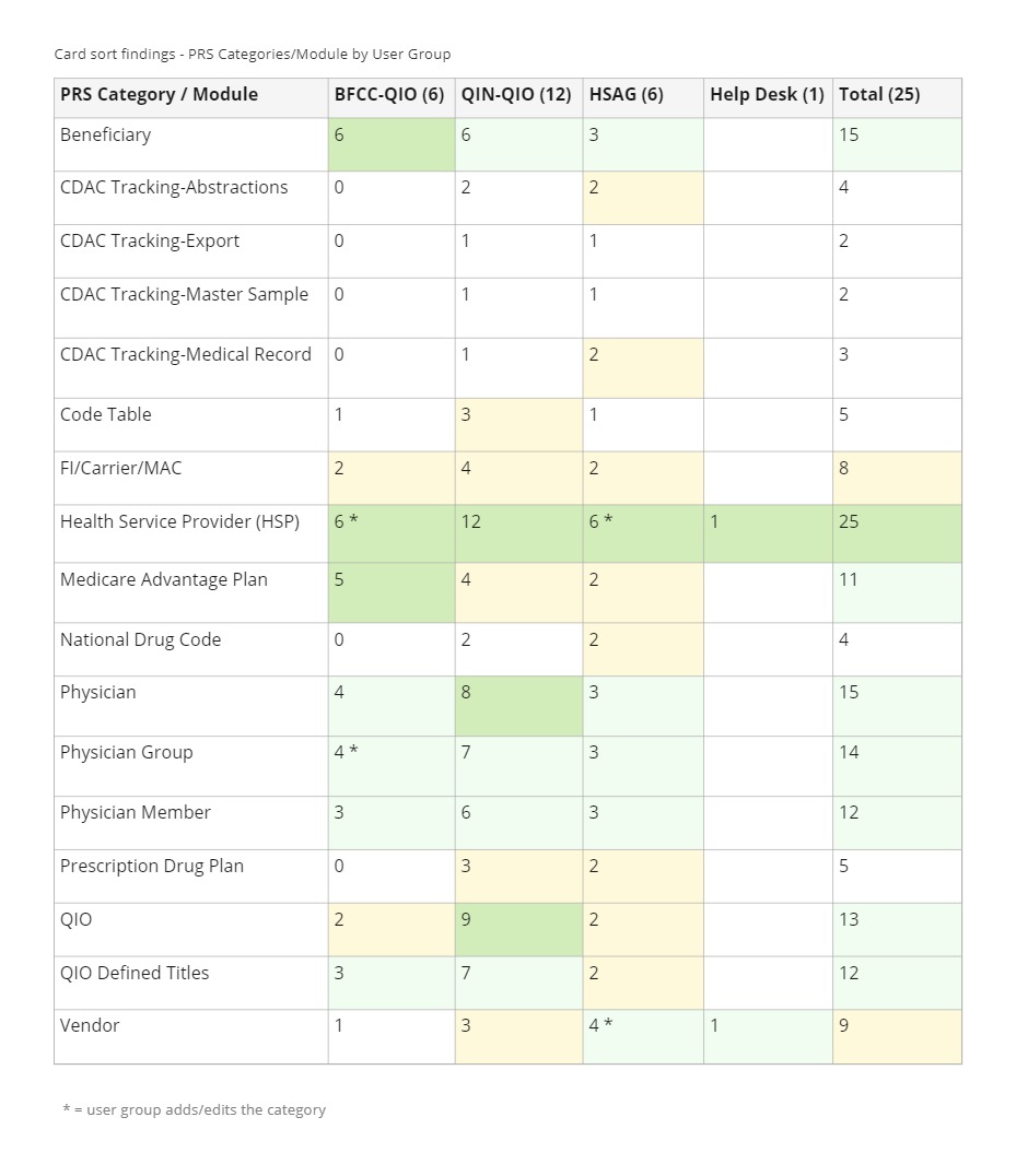
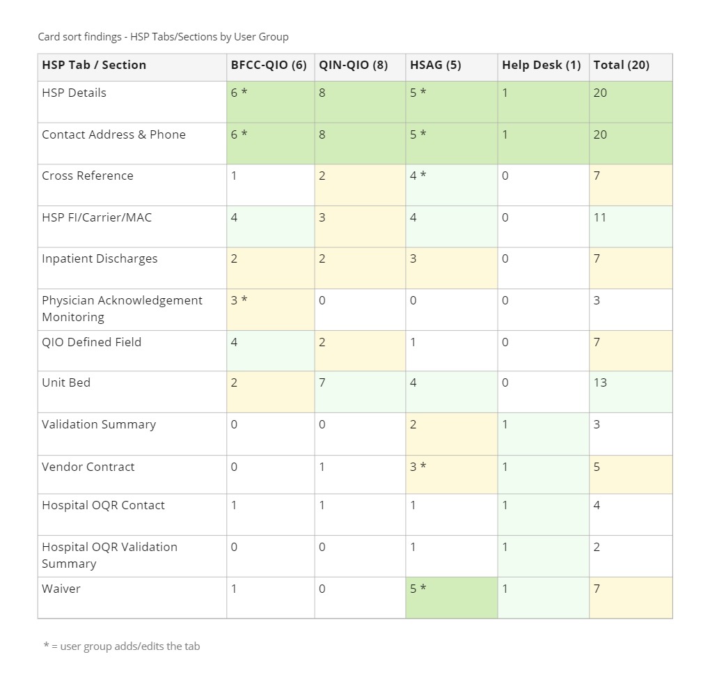
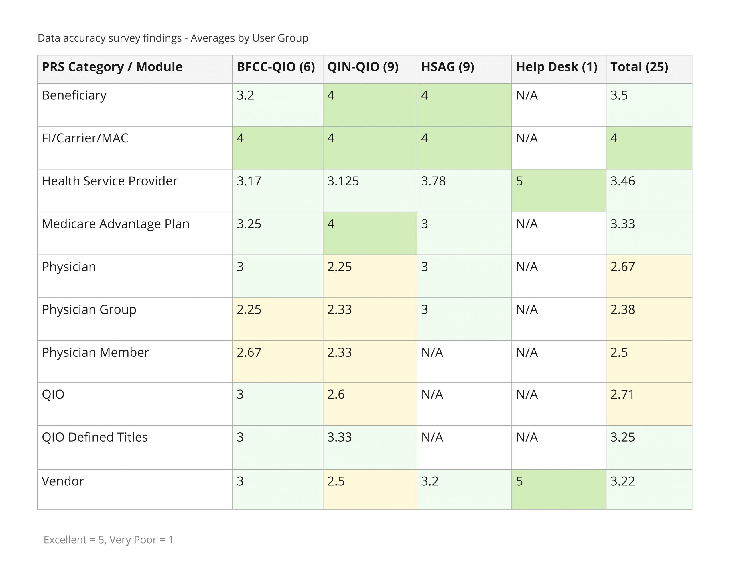
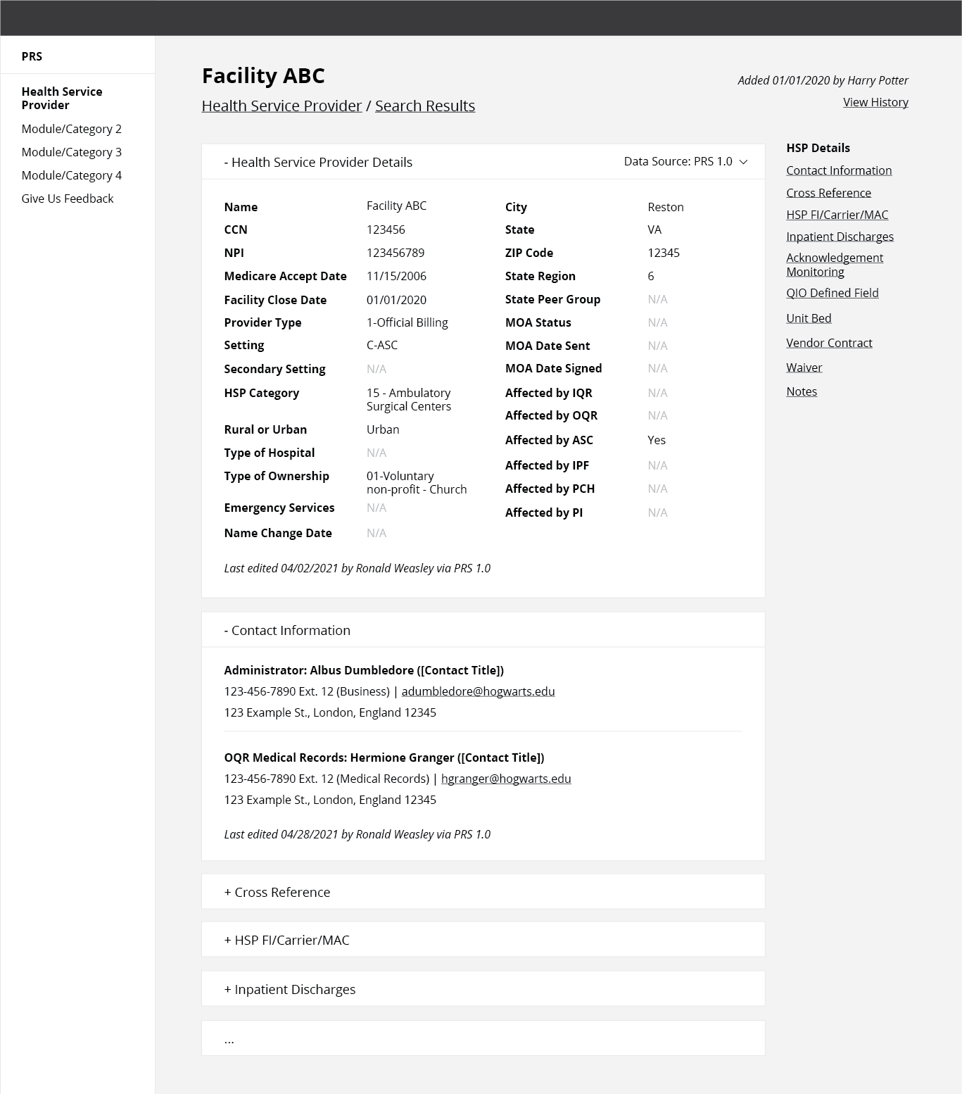
Throughout the project, we consistently conducted one-off efforts to gather user data, such as surveys and card sort activities. These quantitative methods helped inform the prioritization of features, including card sort activities that determined that the Health Service Provider category and HSP Details + Contact Information sections should be prioritized for MVP. It also showed us which categories would not need to be migrated into the new system. A data accuracy survey helped inform how users feel about the quality of the data in the system, so we could prioritize the backend data flow issues.
Documenting the research
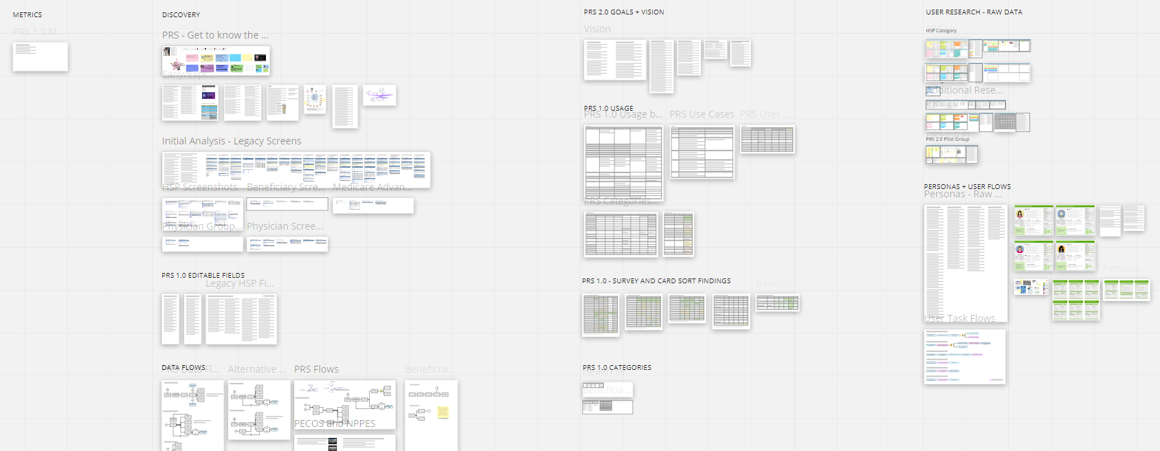
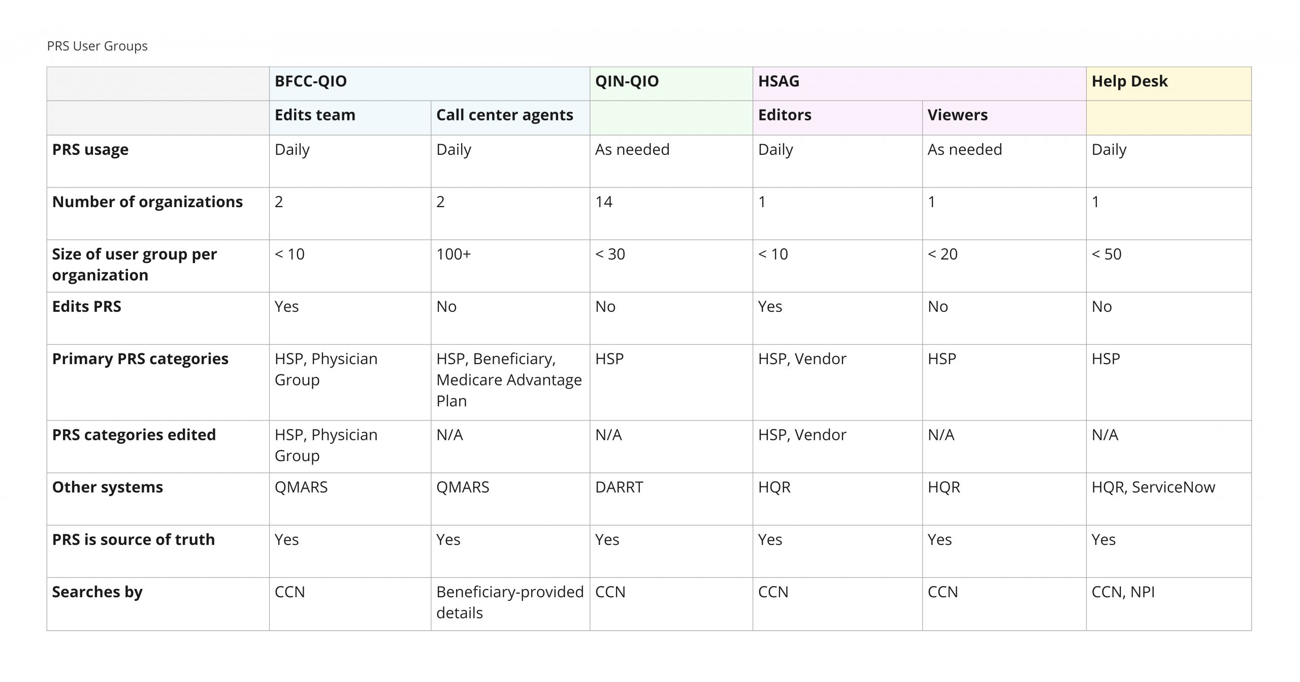
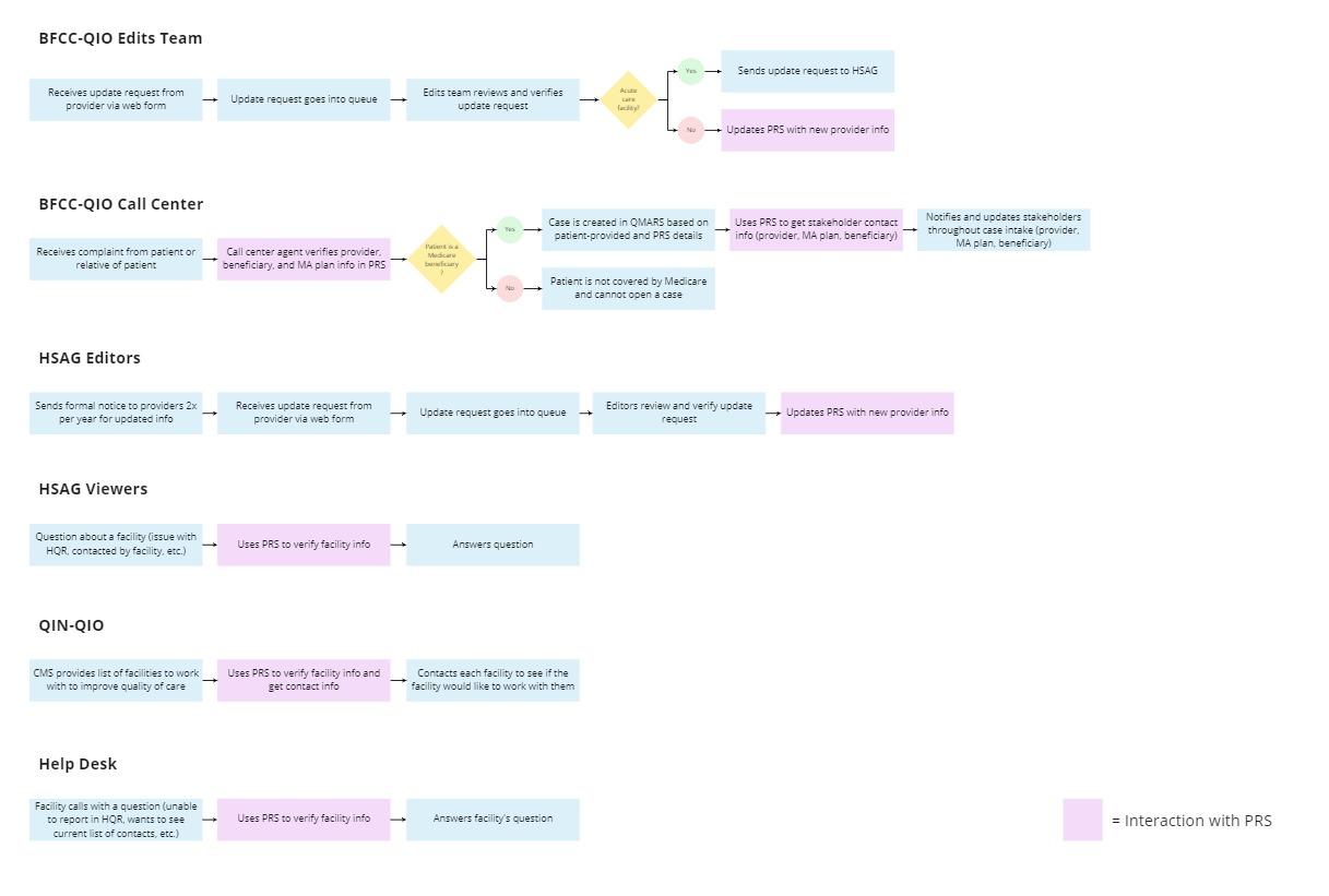
From the beginning of the project, we used Miro as the project source of truth to serve as a living document for all project research, including end user research and backend data analysis. This allowed UX and developer research to live in one location, accessible by the team and clients at a single URL. Throughout the project, we created various artifacts on Miro to document and communicate our research findings in an organized manner (especially tables), which have been greatly helpful during project onboarding. The Miro board continues to grow as we learn more and research other categories within the system.
Wireframe usability testing
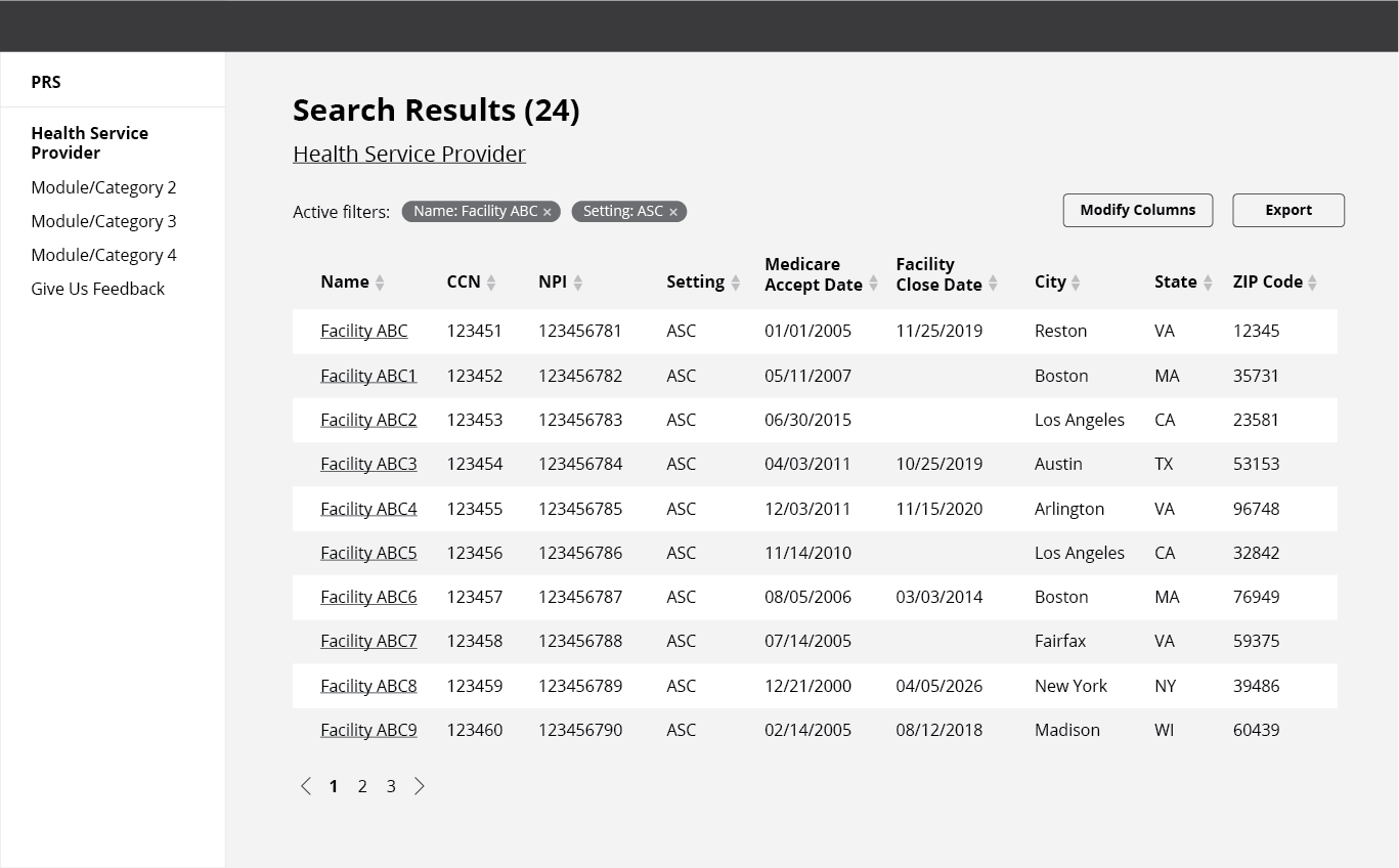
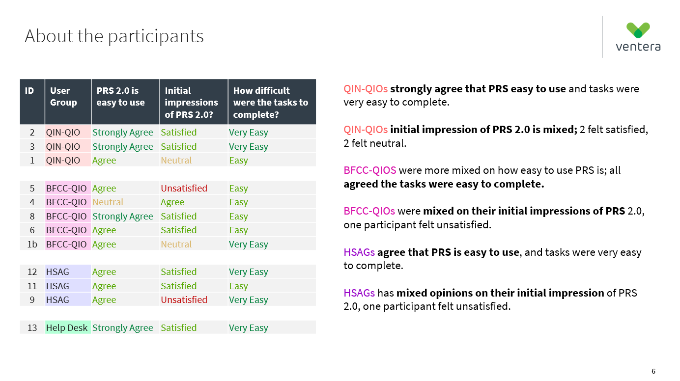
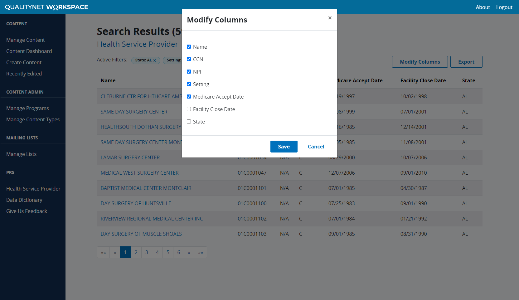
To validate the design and ensure end users were able to easily learn and understand how to use the system, we conducted 6 wireframe usability testing sessions across the 4 user groups. Participants were asked to perform key tasks on a clickable wireframe InVision prototype, such as searching for a provider, viewing search results, modifying columns, and viewing provider details. The wireframe results validated the overall usability of the site and confirmed that users would enjoy using new features they didn’t have in the legacy system, such as the ability to modify search result columns and export selected columns. The results also identified more granular details about what users wanted to see in terms of search fields, available search result columns, and provider details.
Building the base UI
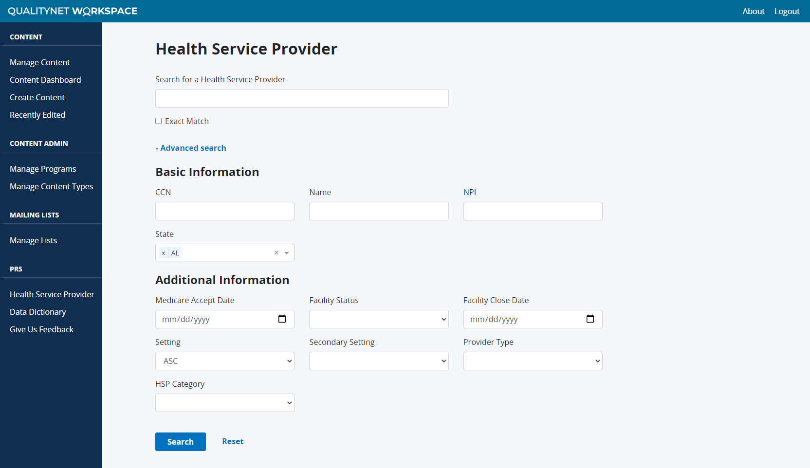
Once the MVP requirements were defined based on the wireframe usability testing results, user stories were logged and the base UI was developed. I developed the initial Angular UI components while other developers worked on hooking the UI to the APIs. This helped ensure the MVP design was implemented as intended and no key fields or functionality were missed in the transition from design to development. The styling standards were already established in the UI code, making it easy to jump from wireframes to high-fidelity.
Documenting organizational personas
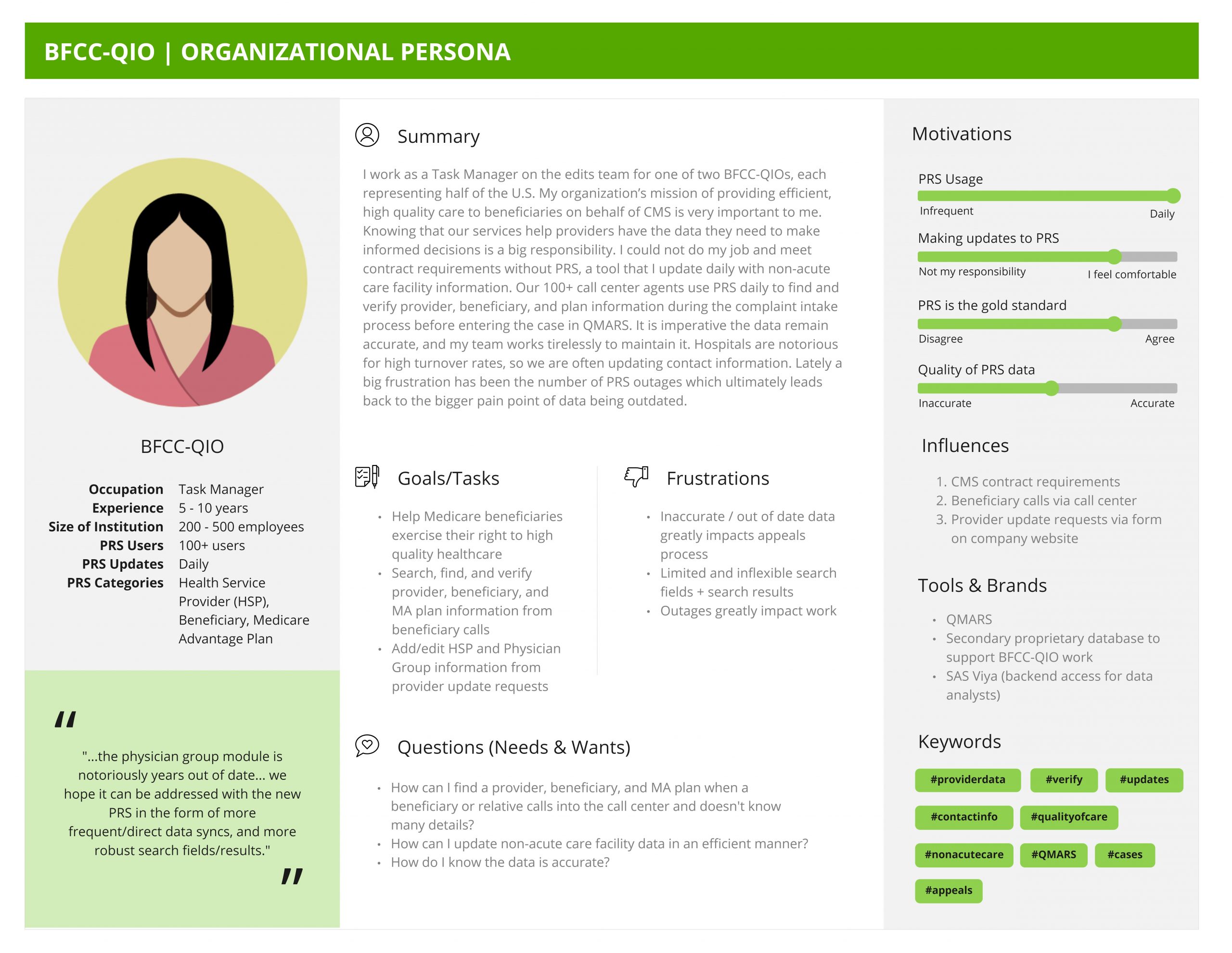
After the initial user interviews and wireframe usability testing, we translated our raw notes about the user groups into polished organizational personas. The personas document key information about each of the user groups, including how often they use the system, if they edit the system, top tasks, frustrations, questions, and more. The personas have been frequently used as artifacts to help the team understand who they’re building for, particularly during onboarding.
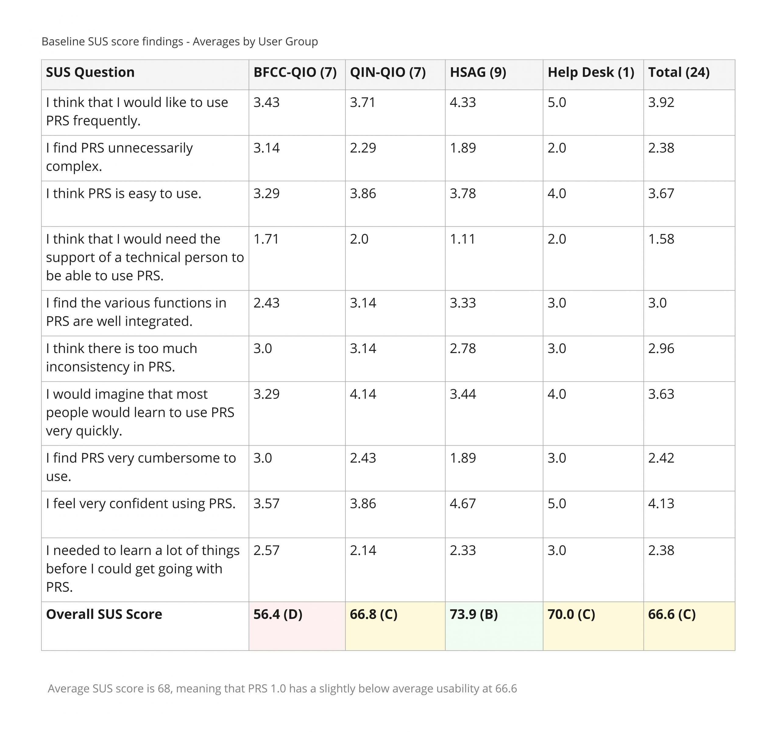
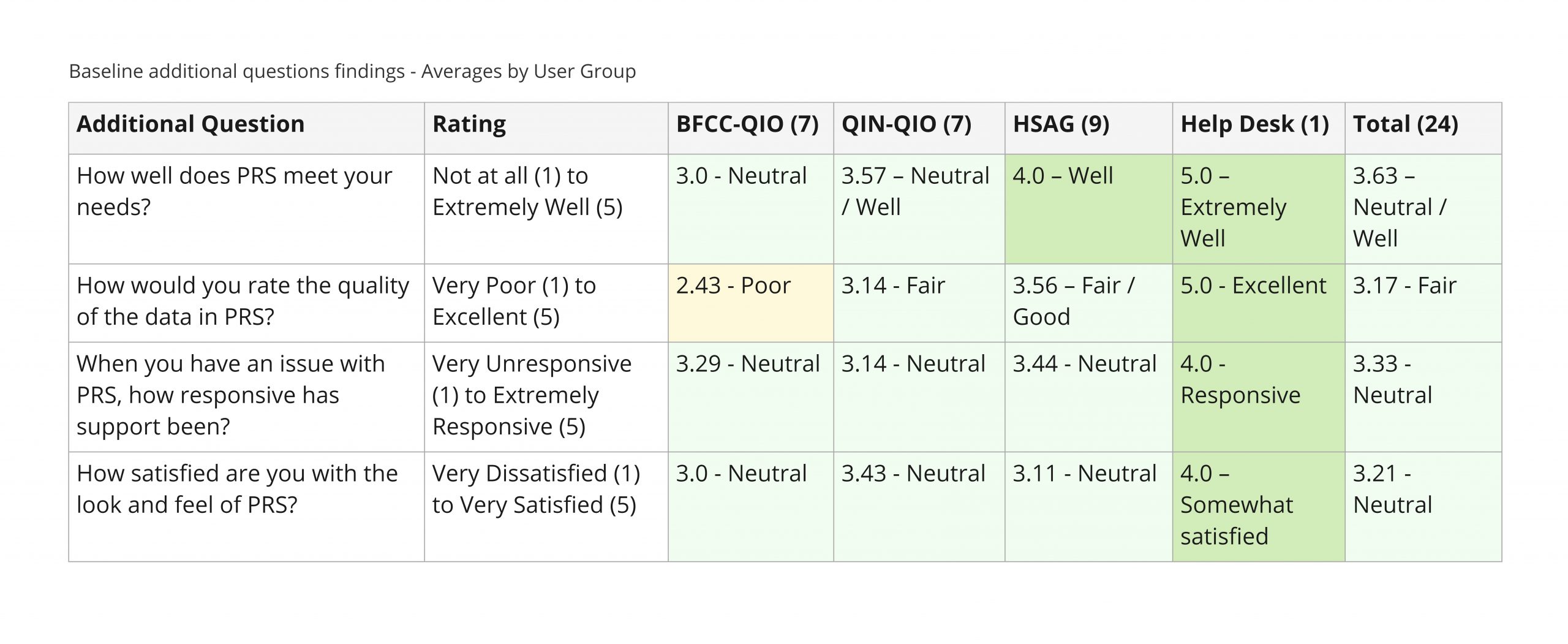
Gathering baseline metrics
Before the legacy system is decommissioned, we gathered baseline metrics on the legacy system. We wanted a benchmark to compare the new system against, so that we could quantitatively measure the system’s improvement. The baseline survey consisted of 10 System Usability Scale (SUS) questions and additional Likert scale questions to gather quantitative metrics on the usability and overall satisfaction of the legacy site. The results showed that the legacy system met users’ basic needs and had an average SUS score of 66.6, but there was definitely room for improvement.
Getting pilot group feedback
Before the full release, we conducted a 2-week pilot group with 12 end users across the 4 user groups. Pilot group participants were given access to the site in production and were provided a FAQ document and task lists to complete during the 2 week period. At the end of the 2 weeks, they were asked to complete a survey about their overall impressions and pilot group experience. Participants thought the new system was very easy to use, but was still missing some functionality they’d like to see. Overall, they were excited to see what’s to come next. The pilot group feedback resulted in a series of enhancement stories and associated prioritization for development.
In production
While the MVP is in production, there is still a long ways to go before the legacy site can be decommissioned. Multiple categories and sections still need to be migrated, and fixing the backend data flow issue will require cooperation across of a lot of different teams at CMS. We continue to conduct research studies and iterate on designs, deploying new enhancements to users every 2 weeks. Future planned research initiatives include Beneficiary testing, Contact Information edits testing, performance testing, legacy baseline usability testing, and more.
Results and outcomes
- Successfully deployed MVP on time with prioritized features
- 130 users in production as of mid-October 2021 and growing
- Problem statements, vision, short term, and long term goals identified
- Modernized look and feel and implemented modern form design principles
- Less clicks to do common tasks (e.g. from 15 clicks to 6 clicks to add 3 states to search)
- 12 out of 12 of pilot group participants thought PRS tasks are easy or very easy to complete
- 11 out of 12 pilot group participants think PRS is easy or very easy to use
- Dozens of research artifacts created on Miro (e.g. 4 PRS organizational level personas)
- Responsive for mobile and accessible/508 compliant
